Student Work – Freddy Taylor
June 7, 2011 | 15 Comments
Designed by Freddy Taylor | Country: United Kingdom
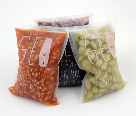
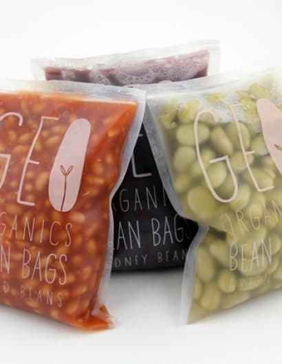
“Brief: Walk into any supermarket, choose a brand you dislike and re-brand & re-package, anything goes.
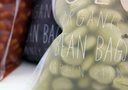
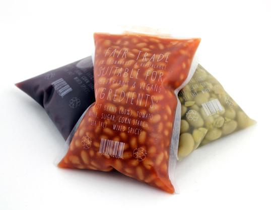
Concept: Try and reflect the honesty of the organic brand and product through innovative packaging and a new logo.
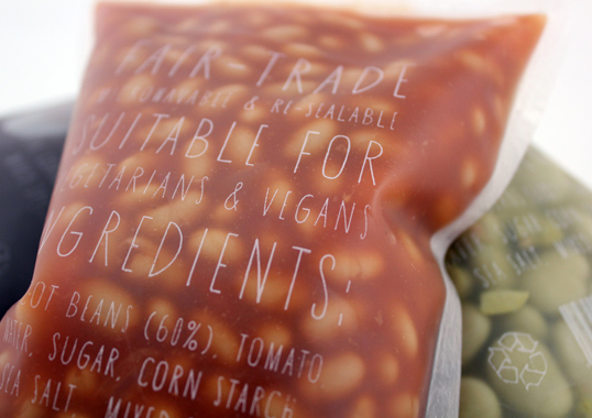
Prototype: Made from shower curtain, sealed with hair straighteners and then screen printed.”
Comments
Warning: count(): Parameter must be an array or an object that implements Countable in /nfs/c02/h06/mnt/28959/domains/lovelypackage.com/html/wp-includes/class-wp-comment-query.php on line 399
15 Responses to “Student Work – Freddy Taylor”
Your Comment
June 7th, 2011 @ 8:44 am
Fabulous piece of branding and packaging. Simple but brilliant.
June 7th, 2011 @ 4:45 pm
The graphic design is great, and so is the method by which Freddy made it (creative!). However, take off the graphics and what is left seems to be something you would see lying around in a school cafeteria. It doesn’t make the product look “appetizing” enough for me to buy it off the shelf.
I think in general, designers are much too preoccupied with fads rather than finding out what works and what doesn’t.
June 8th, 2011 @ 7:42 am
I am a HUGE fan of this. I think this is just so clever. I want to get some ASAP.
Great font choice as well.
Amazing job.
Make some for olives too
June 8th, 2011 @ 12:29 pm
I think the food actually does look appetizing, as you get to see the food itself. When was the last time you purchased beans such as this and you could see them through the package? This package brings the feel of buying produce to something else. Well done.
June 10th, 2011 @ 9:00 am
Honest, simple, smart and oddly tasty in a completely original way. There’s not much that I don’t love about this package, especially given the current climate of distrust in everything we consume.
June 11th, 2011 @ 8:38 pm
I like the idea, I just hope its not a vinyl shower curtain!!
June 23rd, 2011 @ 11:40 am
I adore the design! Its so clever and sweet. My problem with it is that it lacks a lot of regulatory content like weight content and nutrition facts. Working those necessary information in to a minimal and clean design should have been the largest challenge of the project.
June 26th, 2011 @ 10:45 am
of course Tyler. but that can happen in the back without destroying at least the front/main view of the overall packaging.
anyways, i think as you see the beans it actually gives you an idea of a clean farming and that of course, nowadays, it’s very important to catch the healthier costumers.
July 1st, 2011 @ 1:43 pm
Wow! As a graphic design student as well, thats a great piece! *ninja bow*
July 8th, 2011 @ 3:10 am
Definately something I want to like… But I’m not sure I actually do. The plastic doesn’t work with the foods. Kinda like the smell of nail varnish whilst eating Sheperds Pie???
It does look really cool but maybe suits something inedible.
September 2nd, 2011 @ 1:19 pm
How do you cut it open without minimum spilling of the liquids?
September 28th, 2011 @ 2:01 pm
what happens if you don’t want to consume all of the content in one go? you’d have to decanter into a tupperware! which seems silly after so much thought has gone into the packaging…………
November 10th, 2011 @ 6:19 pm
The packaging is re-sealable and was designed with an easy tear ‘pull’ (both found at the top)
thank you all for your kind and constructive comments
December 2nd, 2011 @ 10:03 am
nice work, freddy.
April 26th, 2012 @ 6:22 am
ge O – girl body