Designed by: PepsiCo Design & Innovation
Country: United States

Student Work – Heesang Lee

Student Work - Heesang Lee

Designed by Heesang Lee | Country: United States

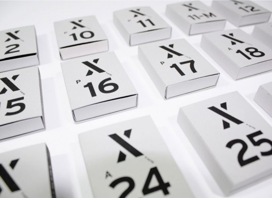
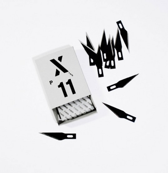
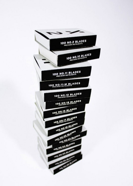
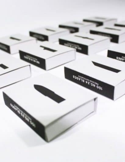
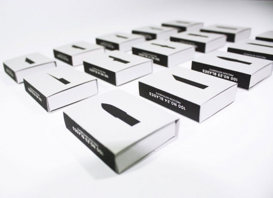
“I usually purchase 100 blades set for myself  because it is convenient as it lasts more than one year. Most people usually use #11 blade, but there are 14 more different type of blades and we need a different kind of blades in occasion. I found information on the package is hard to interpret because it is explained as a small diagram placing in the bottom. My focus on this new design is consumers can easily know what they need at a glance. Firstly I redesigned X-Acto logo. The ‘X’ is a stenciled letter that becomes a symbolic mark for X-Acto knife. Then I simplified information of the package, the numbers in the center are the blades number, and the back illustrations show the shape of blades.”

Student Work - Heesang Lee

Student Work - Heesang Lee

Student Work - Heesang Lee

Student Work - Heesang Lee

Get the latest packaging design inspiration in your inbox:

Popular designs

Laphroaig’s Wellington Boot-Inspired Gift Packaging Design

Laphroaig leverages story-telling to engage new drinkers, transforming the iconic green wellies into a giftable, reusable packaging for their single malt whisky. The wellie-inspired design disrupts traditional Scotch packaging, adding a playful touch to the brand’s history.

Designed by: PepsiCo Design & Innovation
Country: United States

Student Work – Heesang Lee

lovely-package-hee-sang1

Student Work - Heesang Lee

Designed by Heesang Lee | Country: United States

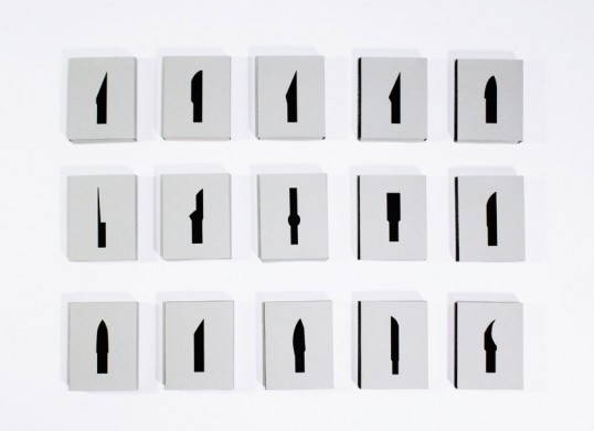
“I usually purchase 100 blades set for myself  because it is convenient as it lasts more than one year. Most people usually use #11 blade, but there are 14 more different type of blades and we need a different kind of blades in occasion. I found information on the package is hard to interpret because it is explained as a small diagram placing in the bottom. My focus on this new design is consumers can easily know what they need at a glance. Firstly I redesigned X-Acto logo. The ‘X’ is a stenciled letter that becomes a symbolic mark for X-Acto knife. Then I simplified information of the package, the numbers in the center are the blades number, and the back illustrations show the shape of blades.”
Student Work - Heesang Lee

Student Work - Heesang Lee

Student Work - Heesang Lee

Student Work - Heesang Lee

Previous slide
Next slide
Get the latest on packaging design in your inbox: