Designed by: PepsiCo Design & Innovation
Country: United States

Student Work – Januar Rianto

hurraa1

Designed by Januar Rianto | Country: Malaysia

“The brief is to design an alcoholic bottled label as well as choose the right bottle, so it suits the concept chosen.”

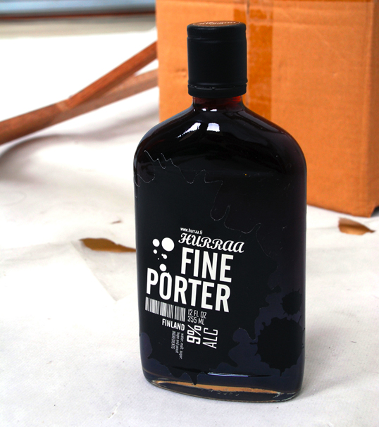
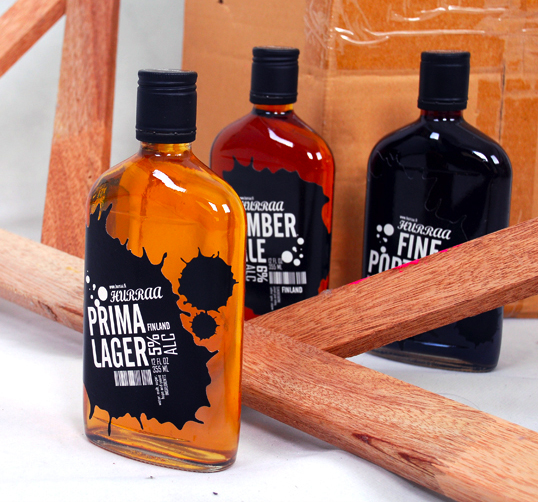
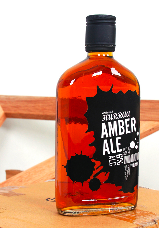
About the name: named after the Finnish language, which literally means ‘Cheers’ and symbolizes happiness and joy. During family or friend gatherings, we usually serve beer and toast before we drink it, raise our bottle/can/glass and say ‘Cheers’. This is how people show their joy, fellowship and warmth to each other.

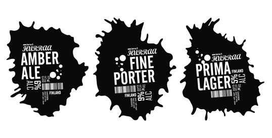
About the splashes: It might be water (here, water refers to beer) that splashed out during the toast. The splashes symbolize the energy, spirit and the power of the people.

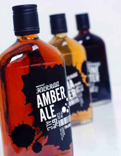
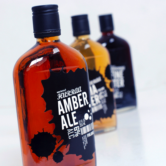
About the label: to design something different for bottled beer labeling and packaging, not only different, but fresh. I simplified them, by only using one label in the front, with clean typographic arrangements. All of the information is clearly and nicely arranged in one label with the shape of water (beer) splashes, different shapes for each type of beer.”
hurraa2

hurraa3

hurraa4

hurraa5

hurraa6

Get the latest packaging design inspiration in your inbox:

Popular designs

ZARA SKIN: More Sustainable and Refillable Packaging Design

Discover ZARA SKIN: a revolutionary skincare range reflecting ZARA’s minimalist aesthetic. With refillable, nature-inspired packaging, the line champions conscious consumption and environmental responsibility, offering an inclusive range of products for the 21st-century consumer.

Innovative Design and Packaging of Teeling Whiskey Crystal Malt

Explore the innovative packaging design of Teeling Whiskey Crystal Malt. A dark screen printed bottle with a Marque™ aluminum label, textural dimension, and a seamless diamond pattern, embodies the brand’s commitment to unconventional expressions.

Designed by: PepsiCo Design & Innovation
Country: United States

Student Work – Januar Rianto

hurraa1

hurraa1

Designed by Januar Rianto | Country: Malaysia

“The brief is to design an alcoholic bottled label as well as choose the right bottle, so it suits the concept chosen.”

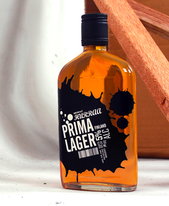
About the name: named after the Finnish language, which literally means ‘Cheers’ and symbolizes happiness and joy. During family or friend gatherings, we usually serve beer and toast before we drink it, raise our bottle/can/glass and say ‘Cheers’. This is how people show their joy, fellowship and warmth to each other.

About the splashes: It might be water (here, water refers to beer) that splashed out during the toast. The splashes symbolize the energy, spirit and the power of the people.

About the label: to design something different for bottled beer labeling and packaging, not only different, but fresh. I simplified them, by only using one label in the front, with clean typographic arrangements. All of the information is clearly and nicely arranged in one label with the shape of water (beer) splashes, different shapes for each type of beer.”
hurraa2

hurraa3

hurraa4

hurraa5

hurraa6

Previous slide
Next slide
Get the latest on packaging design in your inbox: