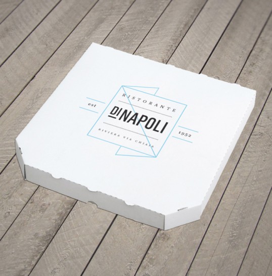
Designed by Jonathan Faust | Country: Portugal
“Visual identity and packaging to Di Napoli – a restaurant and take away as well. The identity is inspired by the biggest passion in Napoli. Soccer. But also the Italian traditions and Italian’s sense of fashion and style. The light blue logo is a shape between a napkin and the letter ‘N’.”