Designed by: PepsiCo Design & Innovation
Country: United States

Student Work – Kamila Mitka

Student Work - Kamila Mitka

Designed by Kamila Mitka | Country: Poland

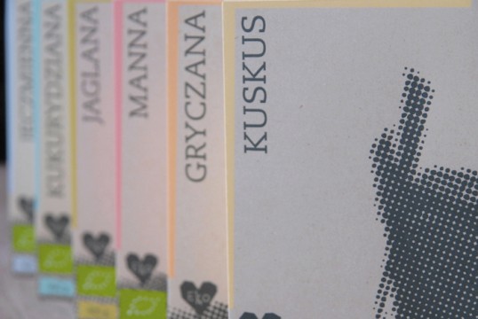
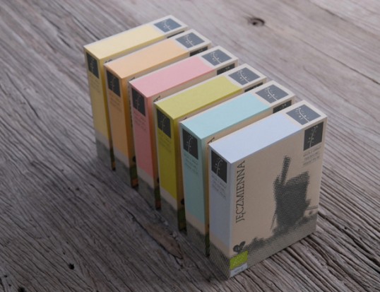
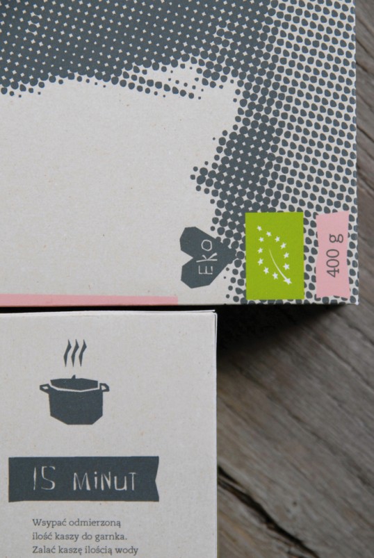
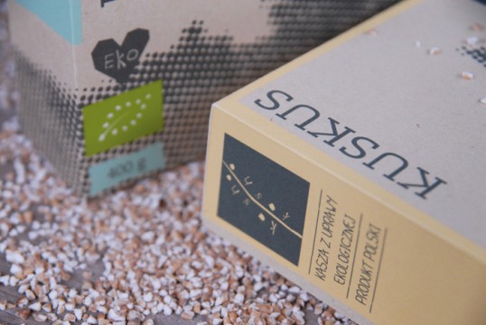
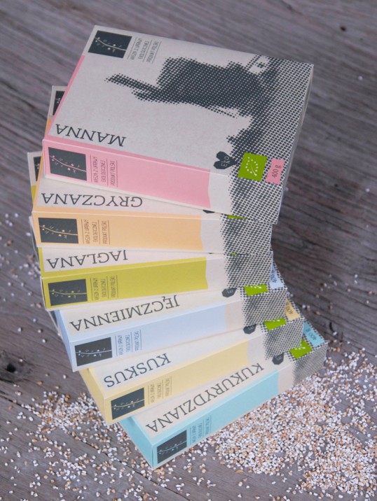
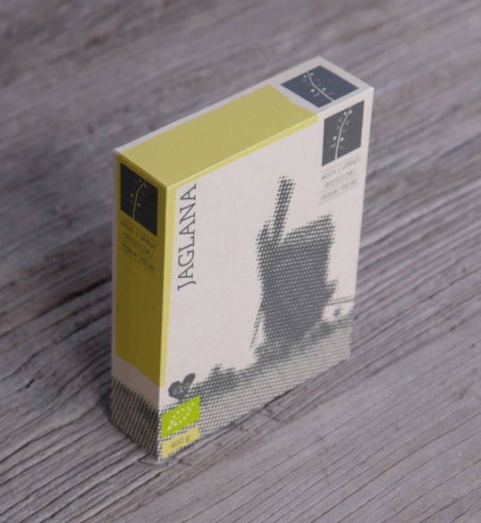
“Kasha Kasha is a new Polish brand of carefully selected eco-friendly agricultural products. The brand is targeted at young consumers concerned about healthy eating. The main objective of the project is a display of honesty. The cardboard packaging communicates unambiguously its ecological sourcing, while the subtle colouringis the effect of the application of eco-friendly printing methods. The image on the front of the packaging underlines the tradition associated with the product. Raster used for the image of a mill is intended to reflect the textureof the grains inside the box.”

Student Work - Kamila Mitka

Student Work - Kamila Mitka

Student Work - Kamila Mitka

Student Work - Kamila Mitka

Student Work - Kamila Mitka

Get the latest packaging design inspiration in your inbox:

Popular designs

The Port Vodka Lemon Water

Overview: In response to my client’s vision for a Cape Cod themed beverage brand, I embarked on the journey to create The Port

Over the wave

This Kombucha originates in Lombok, Indonesia, where its paradise beaches attract hundreds of surfers eager to ride the waves. When you surf,

Far Out Bar

Description: Far Out Bar is a cutting-edge packaging design project created for High Life Farms’ macrodose THC chocolate bars. This project involved

Designed by: PepsiCo Design & Innovation
Country: United States

Student Work – Kamila Mitka

lovely-package-kasha-kasha2

Student Work - Kamila Mitka

Designed by Kamila Mitka | Country: Poland

“Kasha Kasha is a new Polish brand of carefully selected eco-friendly agricultural products. The brand is targeted at young consumers concerned about healthy eating. The main objective of the project is a display of honesty. The cardboard packaging communicates unambiguously its ecological sourcing, while the subtle colouringis the effect of the application of eco-friendly printing methods. The image on the front of the packaging underlines the tradition associated with the product. Raster used for the image of a mill is intended to reflect the textureof the grains inside the box.”
Student Work - Kamila Mitka

Student Work - Kamila Mitka

Student Work - Kamila Mitka

Student Work - Kamila Mitka

Student Work - Kamila Mitka

Previous slide
Next slide

Explore more great package design

Get the latest on packaging design in your inbox: