Student Work – Larisa Mamonova
July 21, 2011 | 16 Comments
Designed by Larisa Mamonova | Country: United States
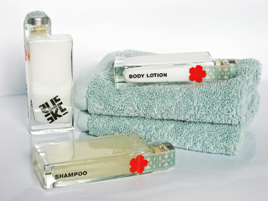
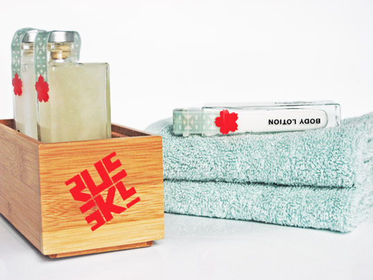
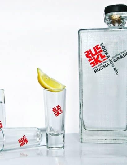
“Russky is a project for logo class where we had to come up with a hotel idea. I decided to go with Russian theme for my hotel idea. Russky would be a prestigious and luxurious boutique opening it’s location in the heart of San Diego. The hotel will have identity and branding system to appeal to hip and urban young professionals, ages 25-40. The unique challenge of this task was not to relay on stereotypical elements of Russian culture that American audience is most familiar with, instead I decided to look beyond commonly known novelties. I searched for inspiration from vintage documentation during Soviet Era, 40’s and 50’s Russian fine art, and of course propaganda posters. The key was to combine all those traditional and historical features with the clean look of contemporary design movement. With that combination of ingredients I was able to give a fresh look to a familiar subject of Russian constructivism and old world charm. Russky hotel is a history driven concept without looking dated provides an ultimate New Russian experience that is integrated into brand’s sensibility through luxurious accommodations and attention to detail.”
Comments
Warning: count(): Parameter must be an array or an object that implements Countable in /nfs/c02/h06/mnt/28959/domains/lovelypackage.com/html/wp-includes/class-wp-comment-query.php on line 399
16 Responses to “Student Work – Larisa Mamonova”
Your Comment
July 21st, 2011 @ 12:07 pm
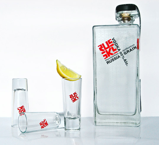
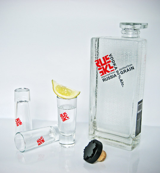
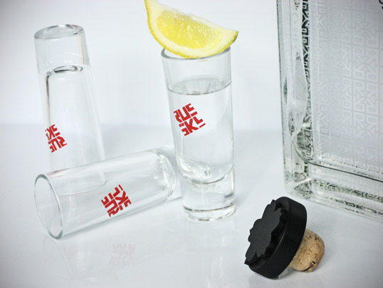
I really dig the logo here. And any hotel with branded shot glasses is ok by me. The alcohol content of vodka is really more like 38-40% though. 90% alcohol content would pretty much be death in a bottle.
July 21st, 2011 @ 12:20 pm
I love the idea of have glass bottles for packaging the body lotion, shampoo’s and other toiletries!
July 21st, 2011 @ 12:21 pm
Good job on the Logo! Love the vodka bottle and the “R” patterns.
Thanks for posting!
July 22nd, 2011 @ 12:01 am
“The unique challenge of this task was not to relay on stereotypical elements of Russian culture that American audience is most familiar with, instead I decided to look beyond commonly known novelties.”
So you wanted to break away from stereotypes about Russia (borscht, Cold War, drunk Russians, vodka, etc.). Bravo!
So your key visual was a vodka bottle? Seriously?
Methinks there be a contradiction here, m’dear.
July 22nd, 2011 @ 12:55 am
yey Lari im so proud of you!! this is awesome
July 22nd, 2011 @ 2:34 am
i just realized that the cap on the bottle is flower shaped.
you have a beautiful package. no pun intended.
pazdravlyAyu!
July 22nd, 2011 @ 4:31 am
Love the clean look of the logo.
July 22nd, 2011 @ 6:15 am
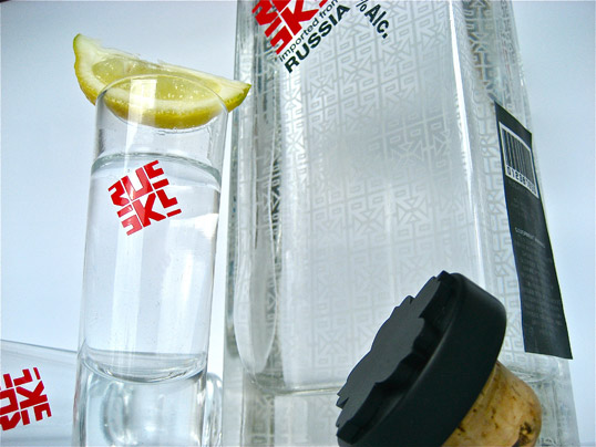
Beatuiful. Love the subtle frosted pattern on the bottle. The logo is nice too.
July 22nd, 2011 @ 8:56 am
The same bottle as Corzo Tequila.
July 22nd, 2011 @ 9:55 am
90% Alcohol Content makes it a medical spirit… some people in Russia don’t mind taking shots of that
July 22nd, 2011 @ 1:42 pm
Hi Everyone, thank you for your compliments and critiques. I am absolutely thrilled to be featured on Lovelypackage.com. Check out my portfolio and let me know what you guys think
Dosvidanjya!
July 22nd, 2011 @ 4:50 pm
Hi Everyone, thank you for your compliments and critiques. I am absolutely thrilled to be featured on Lovelypackage.com. Spasibo!
July 23rd, 2011 @ 2:14 am
This is a beautiful design; I’d definetely buy it if was in production.
Loved the logo, and the clean type treatment. The shape (W-H-D ratio) makes the bottle look elegant to me (and somehow resembles a car radiator:) – which really fits the “Russian” style for me.
Congrats.
July 23rd, 2011 @ 2:35 am
GOOD
July 28th, 2011 @ 3:32 pm
Beautiful design! But there’s a reason why most of the toiletries like shampoo n stuff is not out of glass: Bare skin and slippery floors…nevertheless -> Looks brilliant
July 30th, 2011 @ 4:05 pm
using an existing bottle such as Corzo Tequila, and giving it a whole different purpose with relevance = good design.