Designed by: PepsiCo Design & Innovation
Country: United States

Student Work – Roberta Zanette

gel2

Designed by Roberta Zanette | Country: Brazil | Font: Sketch Block

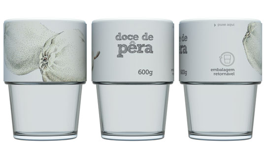
“In 2009, I graduated in Industrial Design at UniRitter (Porto Alegre, Brazil). In order to do my final project, I decided to draw packaging for jam and jellies, because these products are pretty popular not only in the south of Brazil, but also in many other places. I had two main goals with my project: to affect the environment as little as possible and to develop a product with easy access to a great number of people.

Concerning the environment goal, I decided to project a returnable packaging system. After being used, the packaging should go back to their factory, where they would be washed and potted again. In this system, it is not necessary neither to discard packaging nor to manufacture new ones. I chose glass as the packaging material because it is very resistant and it can be recycled without losing any of its physical and chemical characteristics.

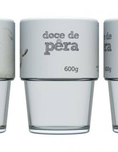
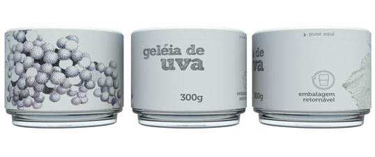
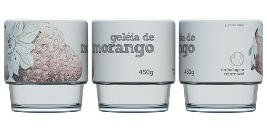
Regarding labeling, I proposed a clean layout, in contrast with many other brands. This characteristic can highlight the product in the retail store gondola. In order to create an attractive packaging, I chose white as the predominant color of the label, which was illustrated by José Lourenço Degani (architect and professor at UniRitter). In addition to this, I decided to show all the obligatory information on the cover, so the rest of the packaging is free to identify the product.

The result of my final project was a packaging system with three different sizes – 600g, 450g and 300g – all in glass format. They were drawn in a way that they could be nested in any order. This characteristic helps the packaging transportation and its stacking, because it decreases the product volume when the packages are empty.

I decided to use vacuum pressure in the closing system, so it is easy to open and close the packaging, and it is also good for the product conservation. Another important characteristic is that the sizes of the cover and the label are the same for the three different packaging sizes.”
gel3

gel1

Get the latest packaging design inspiration in your inbox:

Popular designs

The Bra Guru

Most women are wearing the wrong size bra and that is a fact. The Bra Guru® is the first and only professional

The Port Vodka Lemon Water

Overview: In response to my client’s vision for a Cape Cod themed beverage brand, I embarked on the journey to create The Port

Over the wave

This Kombucha originates in Lombok, Indonesia, where its paradise beaches attract hundreds of surfers eager to ride the waves. When you surf,

Far Out Bar

Description: Far Out Bar is a cutting-edge packaging design project created for High Life Farms’ macrodose THC chocolate bars. This project involved

Designed by: PepsiCo Design & Innovation
Country: United States

Student Work – Roberta Zanette

gel2

gel2

Designed by Roberta Zanette | Country: Brazil | Font: Sketch Block

“In 2009, I graduated in Industrial Design at UniRitter (Porto Alegre, Brazil). In order to do my final project, I decided to draw packaging for jam and jellies, because these products are pretty popular not only in the south of Brazil, but also in many other places. I had two main goals with my project: to affect the environment as little as possible and to develop a product with easy access to a great number of people.

Concerning the environment goal, I decided to project a returnable packaging system. After being used, the packaging should go back to their factory, where they would be washed and potted again. In this system, it is not necessary neither to discard packaging nor to manufacture new ones. I chose glass as the packaging material because it is very resistant and it can be recycled without losing any of its physical and chemical characteristics.

Regarding labeling, I proposed a clean layout, in contrast with many other brands. This characteristic can highlight the product in the retail store gondola. In order to create an attractive packaging, I chose white as the predominant color of the label, which was illustrated by José Lourenço Degani (architect and professor at UniRitter). In addition to this, I decided to show all the obligatory information on the cover, so the rest of the packaging is free to identify the product.

The result of my final project was a packaging system with three different sizes – 600g, 450g and 300g – all in glass format. They were drawn in a way that they could be nested in any order. This characteristic helps the packaging transportation and its stacking, because it decreases the product volume when the packages are empty.

I decided to use vacuum pressure in the closing system, so it is easy to open and close the packaging, and it is also good for the product conservation. Another important characteristic is that the sizes of the cover and the label are the same for the three different packaging sizes.”

gel3

gel1

Previous slide
Next slide

Explore more great package design

Get the latest on packaging design in your inbox: