Designed by: PepsiCo Design & Innovation
Country: United States

Student Work – Ryan Chung

Student Work - Ryan Chung

Designed by Ryan Chung | Country: Canada

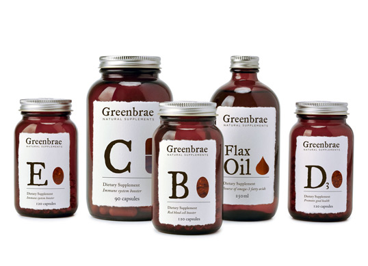
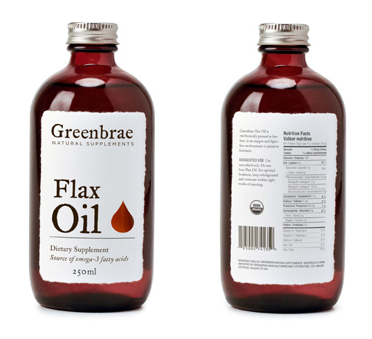
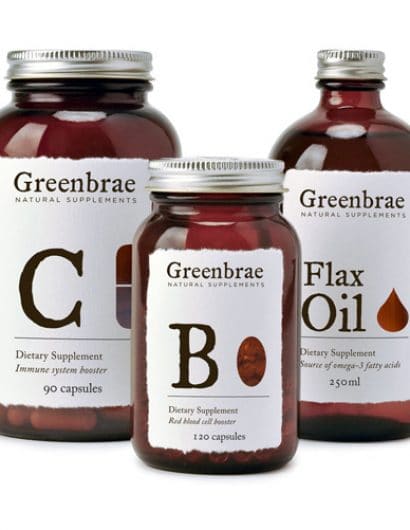
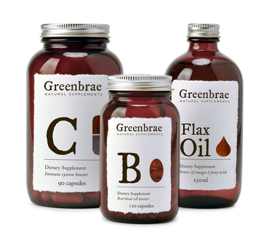
“The brief: To create an identity for a line of vitamins sold in upmarket health food stores and organic markets. Design a logo and packaging.

The solution:The wordmark’s hand-cut feel, paired with modern typography communicates quality. Deckle-edged labels with die cuts reveal the contents of the bottles. The warm brown of the bottles adds a nostalgic touch while protecting the contents from the sunlight.”

Student Work - Ryan Chung

Student Work - Ryan Chung

Student Work - Ryan Chung

Student Work - Ryan Chung

Student Work - Ryan Chung

Student Work - Ryan Chung

Student Work - Ryan Chung

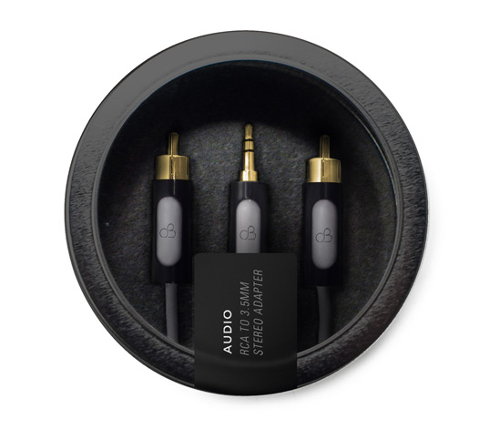
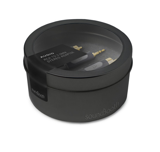
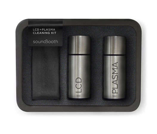
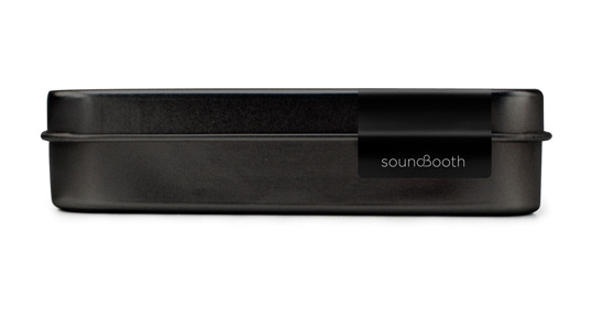
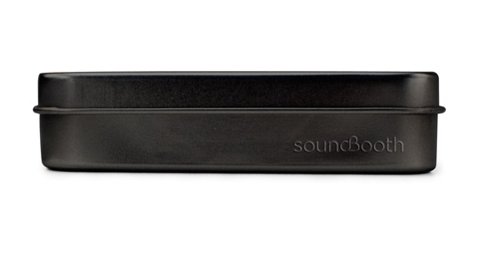
“The brief: To create an identity for a high-end hi-fi stereo equipment boutique with a severe, minimalist look. Design a logo and packaging for the in-house brand.

The solution: The icon within the wordmark references the symbol for decibels, the measure of sound volume. High-end equipment maintains sound quality even at the highest volume. The packaging solutions showcase the products enclosed while reflecting the store’s minimalist identity.”

Get the latest packaging design inspiration in your inbox:

Popular designs

Far Out Bar

Description: Far Out Bar is a cutting-edge packaging design project created for High Life Farms’ macrodose THC chocolate bars. This project involved

The Bra Guru

Most women are wearing the wrong size bra and that is a fact. The Bra Guru® is the first and only professional

Pure Persian Honey

When we look closely at honey packaging, they are almost all in the usual format, and the ultimate in creativity is that

Over the wave

This Kombucha originates in Lombok, Indonesia, where its paradise beaches attract hundreds of surfers eager to ride the waves. When you surf,

Designed by: PepsiCo Design & Innovation
Country: United States

Student Work – Ryan Chung

greenbrae1

Student Work - Ryan Chung

Designed by Ryan Chung | Country: Canada

“The brief: To create an identity for a line of vitamins sold in upmarket health food stores and organic markets. Design a logo and packaging.

The solution:The wordmark’s hand-cut feel, paired with modern typography communicates quality. Deckle-edged labels with die cuts reveal the contents of the bottles. The warm brown of the bottles adds a nostalgic touch while protecting the contents from the sunlight.”

Student Work - Ryan Chung

Student Work - Ryan Chung

Student Work - Ryan Chung

Student Work - Ryan Chung

Student Work - Ryan Chung

Student Work - Ryan Chung

Student Work - Ryan Chung

“The brief: To create an identity for a high-end hi-fi stereo equipment boutique with a severe, minimalist look. Design a logo and packaging for the in-house brand.

The solution: The icon within the wordmark references the symbol for decibels, the measure of sound volume. High-end equipment maintains sound quality even at the highest volume. The packaging solutions showcase the products enclosed while reflecting the store’s minimalist identity.”
Explore more great package design

Get the latest on packaging design in your inbox: