Student Work – Wonchan Lee
October 19, 2012 | 21 Comments
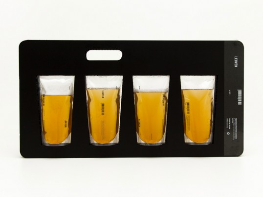
Designed by Wonchan Lee | Country: Australia
“Belgium. Premium. Beer. Those are the three words I had to keep in mind while designing the range.
The aim was to differentiate the brand and packaging from other market competitors as well as clearly communicate and maintain its identity; Premium Belgian beer.
With the understated colour palette throughout the design the colour of beer creates great contrast and stands out.
Not only the material used in the package is lighter, but also more economical than widely used glass, therefore has advantage to both cost and shipping.”
Comments
Warning: count(): Parameter must be an array or an object that implements Countable in /nfs/c02/h06/mnt/28959/domains/lovelypackage.com/html/wp-includes/class-wp-comment-query.php on line 399
21 Responses to “Student Work – Wonchan Lee”
Your Comment
October 20th, 2012 @ 9:03 am
Wow, I’ve never seen anything that would turn off a consumer more than this package. You’re trying to sell beer and instead you make your product look like you’re selling medical urine sample bags? This has to be the most unappealing product package ever!
October 21st, 2012 @ 5:12 am
Very modern looking and elegant.. but am I the only one here who thinks that the packaging looks like a blood bag? LOL
October 21st, 2012 @ 5:43 am
Wow. Thats a lovely bag of Premium Urine.
October 21st, 2012 @ 8:07 am
It’s interesting, but beer is carbonated, and that’s why it is (and must be) packaged in pressure vessels, e.g. round metal,kegs, round metal cans, and round glass bottles.
October 21st, 2012 @ 7:02 pm
Like the exploration and shelf appeal. Unfortunately there’s definitely flawed logic to this system when shipping a carbonated beverage. The bags would inflate with the expanding air. If you’re cool with that, I guess it might work.
Let’s hope the markets don’t open the shipping cases with box cutters. Also, I think the overall environmental impact with this is still more than cans and bottles. Regardless, nice idea!
October 22nd, 2012 @ 6:34 am
I love the innovative thinking behind this, but packaging should not only carry the product, it should also make the product inclosed appealing to consumers. That’s where I see this design falling very short. The product looks more like lab samples, than a delicious beer.
October 22nd, 2012 @ 8:56 am
Lovely visual pun. Terrible practical solution. Beer needs protection from uv, hence brown/green bottles.
October 22nd, 2012 @ 9:05 am
Interesting concept, however how does one consume the beer? It would also get skunked immediately by UV exposure, unless there is an inhibitor in the pouch.
October 22nd, 2012 @ 10:55 am
Props for thinking out of the box, but these look like urine bags. It seems like in your determined focus on being different, you never took a step back to realize what was actually being created.
Keep up the ambitious thinking, but don’t forget to take a 20 ft glance at your in-progress work either.
October 25th, 2012 @ 2:28 am
Interesting concept, but unfortunately ended up looking like 4 packaged bags of urine…
October 25th, 2012 @ 7:40 am
I wouldn’t like to drink anything from those bags >_<.
October 29th, 2012 @ 4:51 am
Full marks for thinking outside the square – but I suspect this was not designed by a beer drinker.
If the same casing could hold 4 bottles, you might be on a winner.
For the record, beer CAN be stored in a clear container, but it uses a tonne of artificial junk and tastes terrible. Take Carlton Cold for example…
October 29th, 2012 @ 5:27 am
“Belgium. Premium. Beer. Those are the three words I had to keep in mind while designing the range.”
There’s nothing premium about drinking flat beer from a piss sack my friend.
October 30th, 2012 @ 4:43 am
Hey man, we have discovered that you have 100% beer into your blood and urine… So, stop drinking now !
This packaging is a monster.
I don’t know how we can mix the visual code of pharmaceutical products with alcohol products like that. That’s simply out of any ethic codes.
Have you ever heard about ethic and deontology ? I don’t think so.
The absurd way we are mixing domains and codes between themselves reveal a profound crisis into the creation – because we don’t have ideas anymore we think we can do whatever we want by oversteping and breaking every codes. But there are some limit we can’t cross.
This ‘monster’ would be perfect into a contemporary art gallery. But not in a supermarket.
I hope we will never sell that.
October 31st, 2012 @ 9:37 am
I agree with Kimberly, great thinking out of the box.
However, no one from Belgium would drink beer out of a plastic bag. We like to drink our beer out of a bottle or a glass. It is part of the whole experience.
November 1st, 2012 @ 8:22 pm
Striking packaging, but would be very bad for the beer. Any UV exposure would cause the hops in the beer to produce skunky phenols and taste terrible. Light exposure is one of the worst problems with beer packaging.
November 28th, 2012 @ 11:39 am
what do you expect from the guy who turned a Didot letter ‘O’ into a nipple for a plastic surgery clinic logo?
January 31st, 2013 @ 6:59 am
I think that the only “positive” thing with this concept is that it has a lot of people talking about it.
July 15th, 2013 @ 12:53 pm
Awesome idea, but it doesn’t work in this situation. Probably better for a Bloody Mary mix or something medical.
September 5th, 2013 @ 3:14 pm
Please, everyone. Don’t rush all at once to share why your opinion is more valid than the next, this person has obviously deserved to be placed on this website for good reason and if you stopped from a second with your self-righteous design critiques and look for the positives in someones work, to start at something and finish it with intention to pull some barriers down about how packaging is ‘supposed’ to be is as important as ever. Follow current design trends all you like but its themes not trends that will stand the test of time. If it its not different, whats your point.
January 24th, 2016 @ 5:10 pm
All of the other comments I think are missing something. No matter if it can work or not this is a beautiful package. It’s so innovative but it doesn’t loose the identity of the product. Cheers to you, I think this is simply amazing