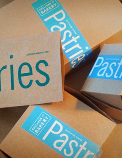
Designed by: Hyperakt | Country: US
Established in 1994, Sullivan Street bakery started its illustrious journey “with the mission to raise the standard for handcrafted, small batch bread.” The company boasts of working closely with suppliers “to find exceptional products.” The sustainable business model of Sullivan Street Bakery has made them a name to reckon with.
Jim Lahey, the man behind the company, established the brand after failing to find the flavors of Italy in New York. The official website of the company mentions the following:
“Jim Lahey thought he was going to be a sculptor. After noticing he couldn’t find bread in New York like the beautiful, crusty loaves he ate in Italy while traveling there as an art student, he took it upon himself to recreate those loaves. In 1994, with the help of Joe Allen, Lahey opened Sullivan Street Bakery and eventually began producing bread for many of the city’s best restaurants.”
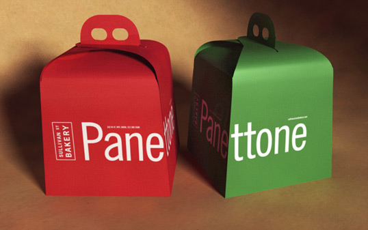

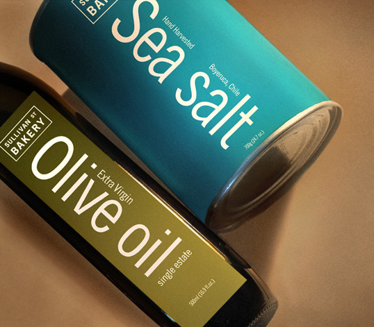
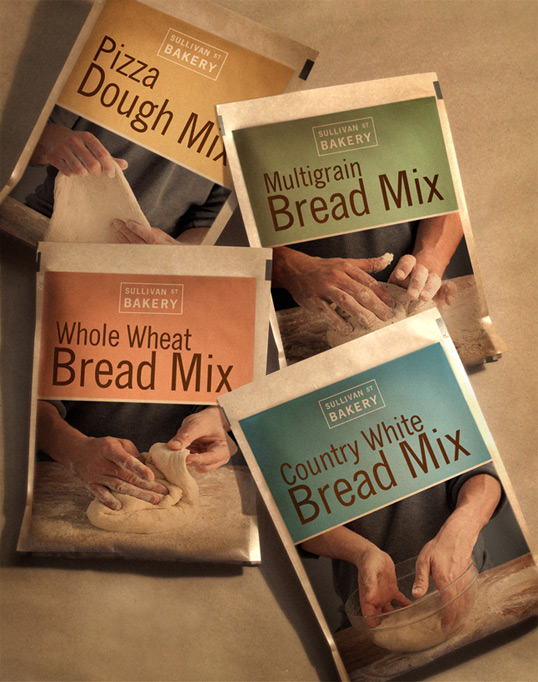

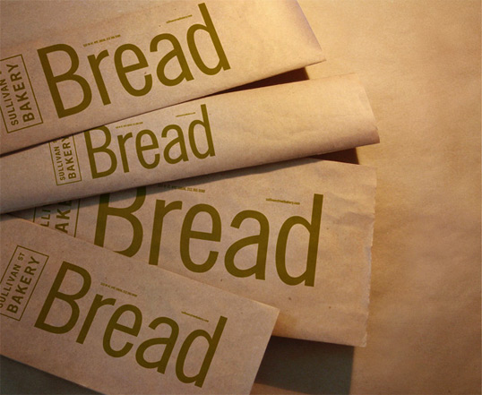
The packaging
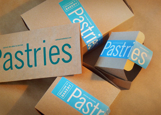
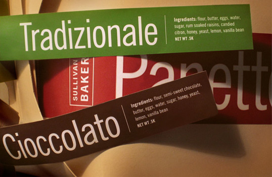
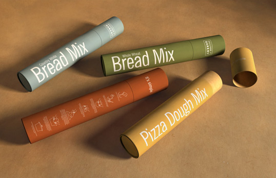
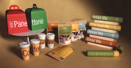
The company partnered with Hyperakt, a New York-based branding agency, to create the awesome packing designs. The branding agency emerged with the perfect solution by creating a visual language that would work across all present and future products. The choice of colors and fonts is one of the highlights of the packaging designs.
“Sullivan Street Bakery makes some of the best bread in New York City. With almost two decades under its belt, it’s a venerable institution in the city’s culinary circles with many top restaurants serving its bread daily. Jim Lahey, the man behind the ovens, is expanding the bakery’s product offerings. He asked us to work in partnership with creative director Greg Crossley on developing a packaging system that would extend the visual language of the bakery across all new and future products.”


