Designed by: PepsiCo Design & Innovation
Country: United States

Svedka Vodka

svedka

Designed by ESTABLISHED | Country: United States | Fonts used: custom type, Snell Roundhand.

“The new bottle for Svedka imported Swedish vodka had to be bilingual: It needed to speak  to younger scenesters who consider themselves “in the know” and hang out at trendy nightspots as well as an older, more affluent consumer who likes to have a drink at home. This meant the packaging had to look equally attractive lit up on the back-bar of a hip club as well as lining a club store’s shelf, said Marina Hahn, svp, marketing for Spirits Marque One, Svedka’s U.S. importer.”
svedka2

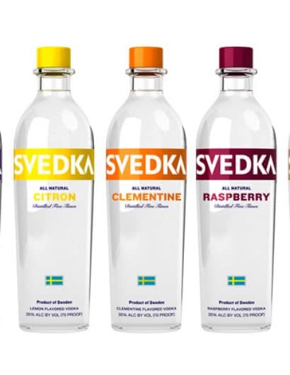
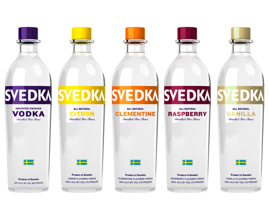
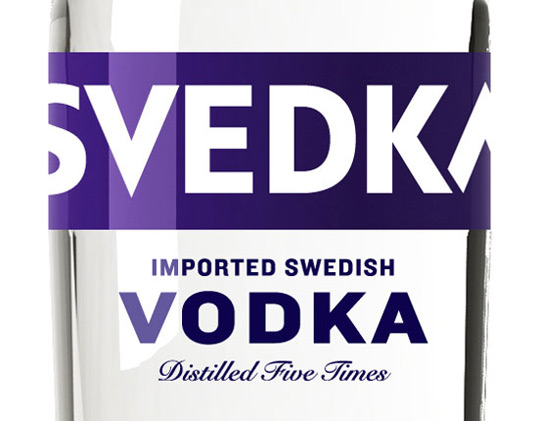
“The Svedka bottle redesign hinged on a combination of two simple details, a glass “collar” that rests underneath the cap and a tapered body. Together, they “create a sophisticated look subtle enough to allow the bottle to stand out at any chic bar while retaining its mass market appeal,” Hahn said. Innovations in technology allowed the brand and its design agency Established, New York, to create a sleek shape  to reflect a more-premium look. This minimalist aesthetic also echoes the brand’s Swedish (read: quality, imported) heritage. The design also boosts brand name visibility. Showcasing “Svedka” against a colored band ensures that it can be read regardless of one’s environment or liquor level.”

Get the latest packaging design inspiration in your inbox:

Popular designs

Designed by: PepsiCo Design & Innovation
Country: United States

Svedka Vodka

svedka

svedka

Designed by ESTABLISHED | Country: United States | Fonts used: custom type, Snell Roundhand.

“The new bottle for Svedka imported Swedish vodka had to be bilingual: It needed to speak  to younger scenesters who consider themselves “in the know” and hang out at trendy nightspots as well as an older, more affluent consumer who likes to have a drink at home. This meant the packaging had to look equally attractive lit up on the back-bar of a hip club as well as lining a club store’s shelf, said Marina Hahn, svp, marketing for Spirits Marque One, Svedka’s U.S. importer.”

svedka2

“The Svedka bottle redesign hinged on a combination of two simple details, a glass “collar” that rests underneath the cap and a tapered body. Together, they “create a sophisticated look subtle enough to allow the bottle to stand out at any chic bar while retaining its mass market appeal,” Hahn said. Innovations in technology allowed the brand and its design agency Established, New York, to create a sleek shape  to reflect a more-premium look. This minimalist aesthetic also echoes the brand’s Swedish (read: quality, imported) heritage. The design also boosts brand name visibility. Showcasing “Svedka” against a colored band ensures that it can be read regardless of one’s environment or liquor level.”

Explore more great package design

Get the latest on packaging design in your inbox: