Designed by mousegraphics | Country: Greece
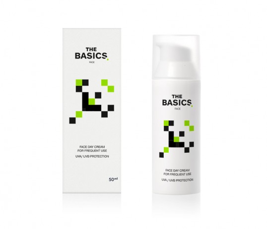
“The Briefing (in brief): “We believe that the existence of extremely specialized products within the cosmetics industry is an exercise on consumerism. We produce 4 types of products which can cover all skin care needs. We named the line “the basics”, and we want a packaging to communicate this.”
The target consumer: All ages. Consumers who prefer a modest and practical shopping approach.
The design: The idea of “the essential” behind the birth of this line is quite simple and comes from a pharmacist with a relevant experience. We used the same straightforward approach for the packaging: white bottles and a design referencing the essential. Our inspiration was the design structure and related function of the highly popular video arcade game, “Space Invaders” (released in 1978). Each of the 4 different bottles in our packaging carries a quasi recognizable shape modeled after an animal or other natural form. The elements forming each shape are the same, the basics, so to speak, but their different configuration creates a series of possibilities.”