Designed by: PepsiCo Design & Innovation
Country: United States

The Gild

The Gild

Designed by Pearlfisher | Country: United Kingdom

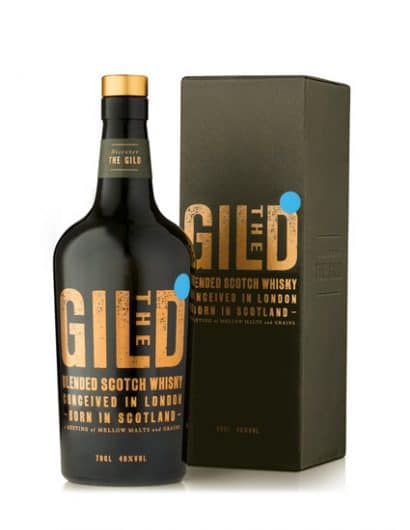
“Task: To create a new standout and authentic whisky brand for the Russian market and beyond that would help make the world of whisky accessible.

Scope: Strategy, brand identity, naming, brand language and tone of voice, structure and graphics.

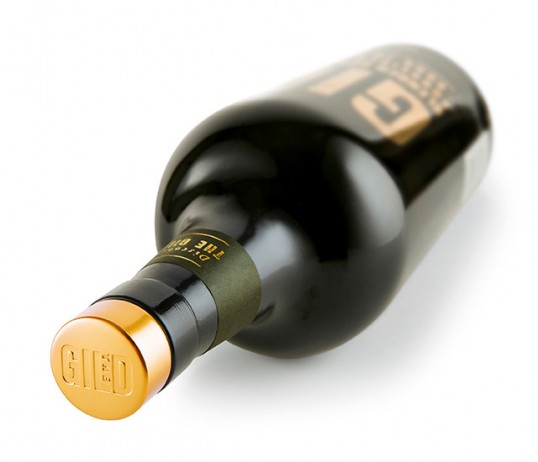
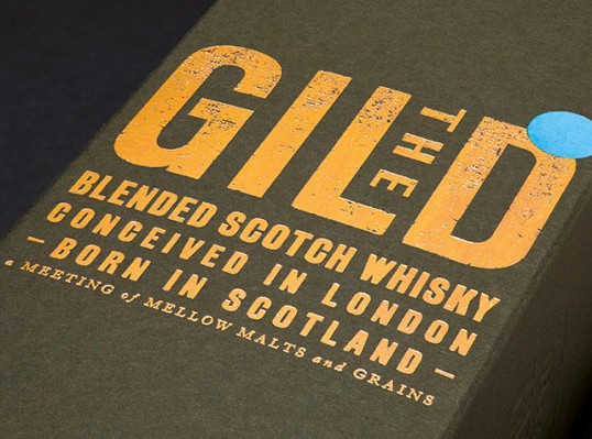
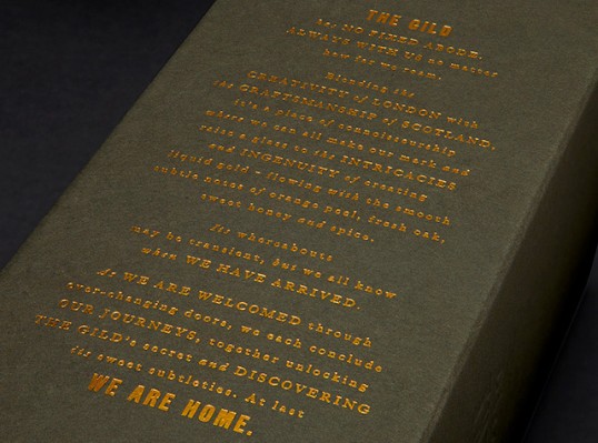
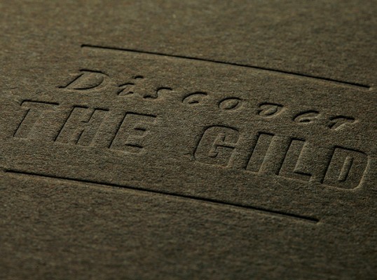
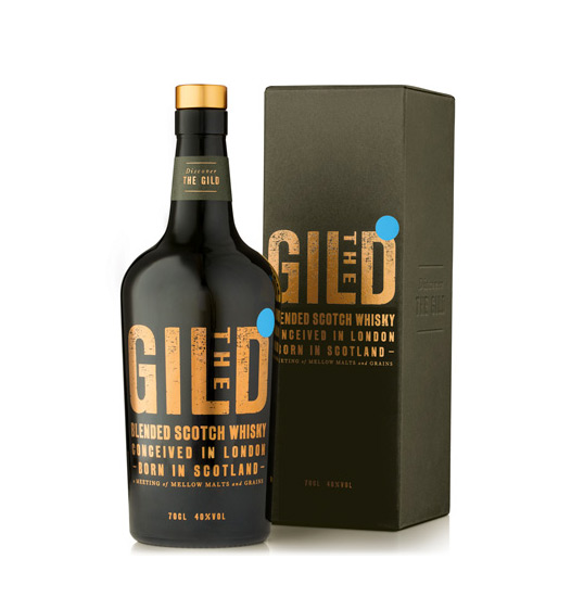
Solution: The new brand and packaging design challenges the category standards and creates a new language for the whisky market. The brand equities are ownable to the Gild and designed to work as recognisable signposts for the whisky community. The brand identity, inspired by letterpress, is bold and authentic and communicates a high level of craftsmanship, clarity and refinement. The name refers back to the guilds of London – the masters and the craftsmen – but has a double meaning with ‘gild’ also referring to the gold standard. The bottle states that the whisky is ‘conceived in London, born in Scotland’ to establish its Western heritage and desirable credentials that the primary Russian audience is seeking.”

The Gild

The Gild

The Gild

The Gild

The Gild

Get the latest packaging design inspiration in your inbox:

Popular designs

Inverey: A Unique Barrel-Aged Scottish Gin Packaging Design

Inverey stands out with its image that captures the essence of the rugged Highland countryside. Breaking away from the norm, the label design does not feature the traditional tartan. Instead, it presents an organised structure of intertwining circles, rhombuses, four-pointed stars and dots born out of their intersection.

Designed by: PepsiCo Design & Innovation
Country: United States

The Gild

lovely-package-the-gild-1

The Gild

Designed by Pearlfisher | Country: United Kingdom

“Task: To create a new standout and authentic whisky brand for the Russian market and beyond that would help make the world of whisky accessible.

Scope: Strategy, brand identity, naming, brand language and tone of voice, structure and graphics.

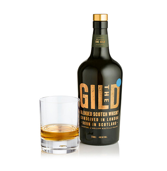
Solution: The new brand and packaging design challenges the category standards and creates a new language for the whisky market. The brand equities are ownable to the Gild and designed to work as recognisable signposts for the whisky community. The brand identity, inspired by letterpress, is bold and authentic and communicates a high level of craftsmanship, clarity and refinement. The name refers back to the guilds of London – the masters and the craftsmen – but has a double meaning with ‘gild’ also referring to the gold standard. The bottle states that the whisky is ‘conceived in London, born in Scotland’ to establish its Western heritage and desirable credentials that the primary Russian audience is seeking.”
The Gild

The Gild

The Gild

The Gild

The Gild

Previous slide
Next slide
Get the latest on packaging design in your inbox: