Designed by: PepsiCo Design & Innovation
Country: United States

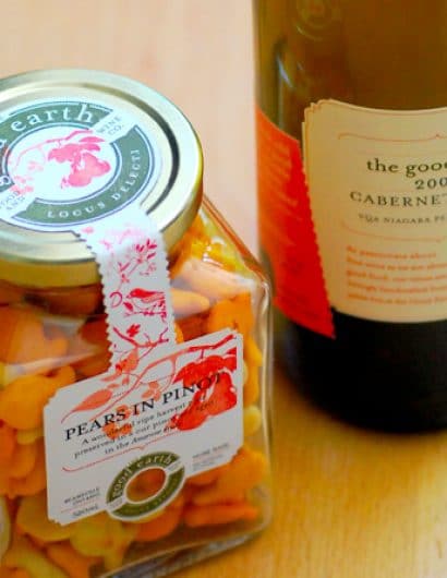
The Good Earth Food & Wine Co.

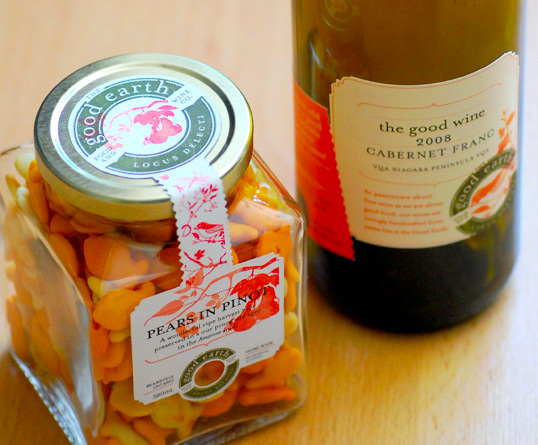
The Good Earth Food & Wine Co.

Designed by Insite Design | Country: Canada | Fonts used: Mrs Eaves

“Truly the health of a wine region is measured by what exists in the spaces between the vines. Niagara has a very healthy and quickly growing region thanks to pioneers in food and experience culture like Nicolette Novak of the Good Earth Cooking School located in the Beamsville Ontario tender fruit belt and respected viticultural area.

After a successful 15 or so years of creating and building one of the regions most exciting farm to table cooking experiences, Nicolette was itchy to throw her hat into the wine arena. With the delicate urging of her peers including Ed Madronich of famed Flat Rock Cellars in Jordan, Nicolette was convinced to go for it in a brand perspective and approached us to look at repositioning her well know identity while also coming up with brand extensions for her wine and food packaging.

This would be no small feat as most wineries have difficulty extending their brands into bigger picture ideas and alternatively, the big ideas have challenges when getting down to the business of executing across many mediums.

The Insite team sketched many possibilities and settled on a scheme of a traditional palette of custom illustrations, textures and graphic stamp like elements that could be rearranged in any manner to create simply beautiful expressions of Nicolette’s thoughts, not unlike an old stationary box full of textures and clippings.

All executions could serve multiple purposes; jam bottle labels could fit any bottle, the logo was designed to translate into a rubber stamp to be applied to papers and wrapping, the stationary could be used for notes, post cards, invitations and so on in order to maximize function and minimize costs.

The end result is a rich fabric of colour and texture that tells the story of what to expect from the dynamic Nicolette and her team of wonderfully talented chef’s and winemakers.”

The Good Earth Food & Wine Co.

Get the latest packaging design inspiration in your inbox:

Popular designs

Introducing Nasbah: Egyptian Product Packaging Design

Uncover how the Egyptian product “Nasbah” is taking a contemporary approach to package design, making a mark in the local market. Learn how the design strategy influences consumer perception and enhances product appeal.

Designed by: PepsiCo Design & Innovation
Country: United States

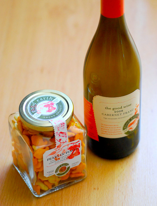
The Good Earth Food & Wine Co.

goodearth1

The Good Earth Food & Wine Co.

Designed by Insite Design | Country: Canada | Fonts used: Mrs Eaves

“Truly the health of a wine region is measured by what exists in the spaces between the vines. Niagara has a very healthy and quickly growing region thanks to pioneers in food and experience culture like Nicolette Novak of the Good Earth Cooking School located in the Beamsville Ontario tender fruit belt and respected viticultural area.

After a successful 15 or so years of creating and building one of the regions most exciting farm to table cooking experiences, Nicolette was itchy to throw her hat into the wine arena. With the delicate urging of her peers including Ed Madronich of famed Flat Rock Cellars in Jordan, Nicolette was convinced to go for it in a brand perspective and approached us to look at repositioning her well know identity while also coming up with brand extensions for her wine and food packaging.

This would be no small feat as most wineries have difficulty extending their brands into bigger picture ideas and alternatively, the big ideas have challenges when getting down to the business of executing across many mediums.

The Insite team sketched many possibilities and settled on a scheme of a traditional palette of custom illustrations, textures and graphic stamp like elements that could be rearranged in any manner to create simply beautiful expressions of Nicolette’s thoughts, not unlike an old stationary box full of textures and clippings.

All executions could serve multiple purposes; jam bottle labels could fit any bottle, the logo was designed to translate into a rubber stamp to be applied to papers and wrapping, the stationary could be used for notes, post cards, invitations and so on in order to maximize function and minimize costs.

The end result is a rich fabric of colour and texture that tells the story of what to expect from the dynamic Nicolette and her team of wonderfully talented chef’s and winemakers.”
The Good Earth Food & Wine Co.

Previous slide
Next slide
Get the latest on packaging design in your inbox: