Designed by: PepsiCo Design & Innovation
Country: United States

The Kings Series

The Kings Series

Designed by Christopher David Thompson | Country: New Zealand

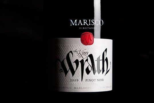
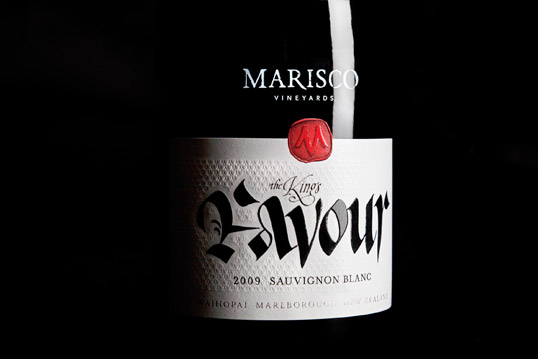
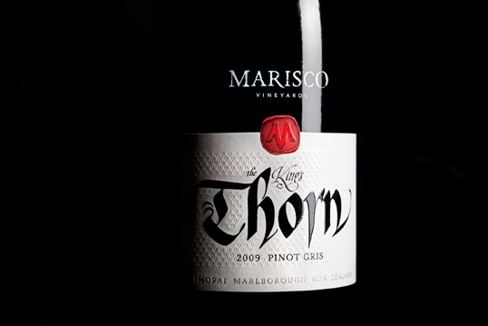
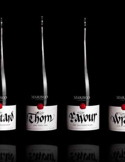
“This was my response to an open brief from my client, to create a brand for a series of wines that would link their Marlborough (NZ) vineyard to the proprietor’s pirate ancestors from Lundy Island (UK).

After being helicoptered out to the island to photograph and research my client’s ancestral history, I returned to New Zealand and came up with the name for each – relating to a specific story discovered in that research. The names were then also matched to the characteristics of a specific wine variety. A top NZ calligrapher, Peter Gilderdale was then invited to create the stunning calligraphy that features on the labels (authentic to the relevant 12th &13thC period of history, but with bit of a modern twist).

There was a moment of deathly silence when I presented the concept to the client for the first time – followed by a very positive outburst! They loved it, and so did the market here in New Zealand. The wine is now being exported to the world…

‘Favour’  & ‘Thorn’ 2010 were jointly awarded “Best Label in Show” at the recent International Aromatic Wine Show”

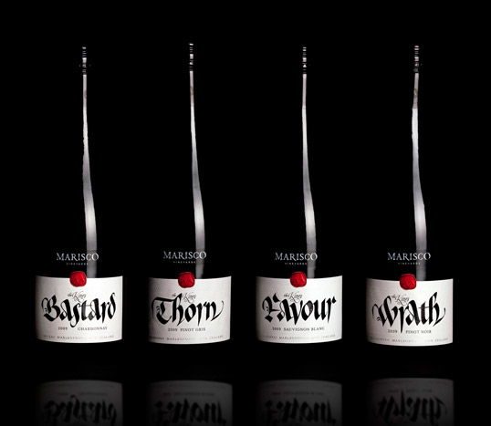
The Kings Series

The Kings Series

The Kings Series

The Kings Series

The Kings Series

Popular designs

D’eyras – Medrono & Olive Oil

What connects D´EYRAS, Medronho, and Olive Oil? They all hail from the same country: Portugal. These trees are indigenous to the region, serving as a testament to the bountiful and diverse Mediterranean flora.

Designed by: PepsiCo Design & Innovation
Country: United States

The Kings Series

king1

The Kings Series

Designed by Christopher David Thompson | Country: New Zealand

“This was my response to an open brief from my client, to create a brand for a series of wines that would link their Marlborough (NZ) vineyard to the proprietor’s pirate ancestors from Lundy Island (UK).

After being helicoptered out to the island to photograph and research my client’s ancestral history, I returned to New Zealand and came up with the name for each – relating to a specific story discovered in that research. The names were then also matched to the characteristics of a specific wine variety. A top NZ calligrapher, Peter Gilderdale was then invited to create the stunning calligraphy that features on the labels (authentic to the relevant 12th &13thC period of history, but with bit of a modern twist).

There was a moment of deathly silence when I presented the concept to the client for the first time – followed by a very positive outburst! They loved it, and so did the market here in New Zealand. The wine is now being exported to the world…

‘Favour’  & ‘Thorn’ 2010 were jointly awarded “Best Label in Show” at the recent International Aromatic Wine Show”
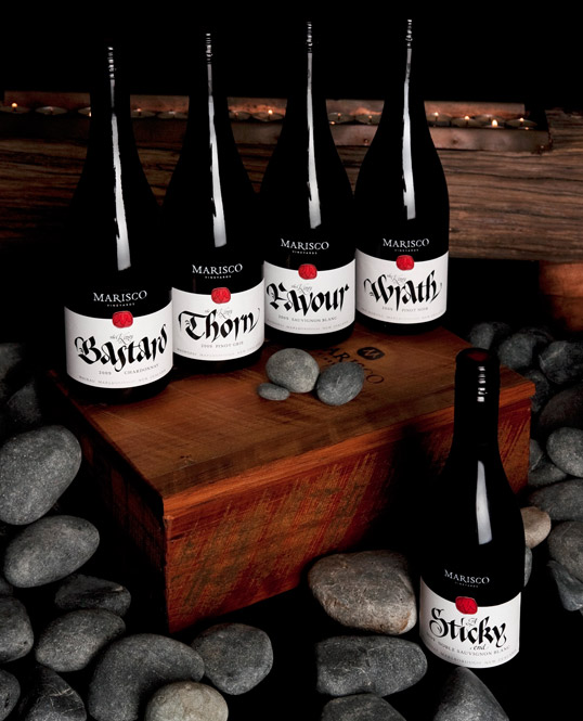
The Kings Series

The Kings Series

The Kings Series

The Kings Series

The Kings Series

Previous slide
Next slide