Designed by Studio Lost & Found | Country: Australia
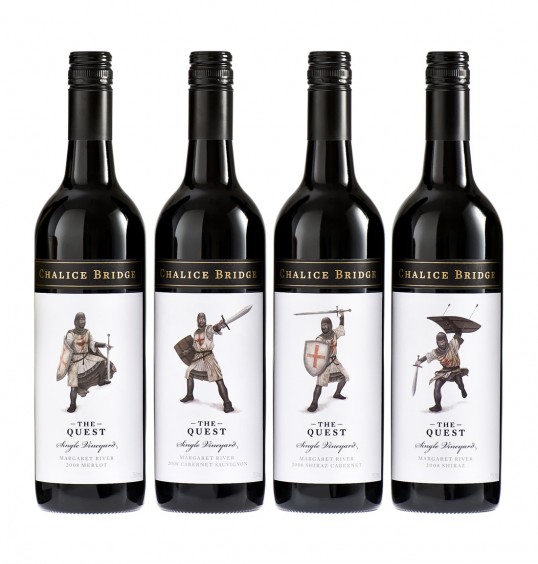
“The Quest wine labels were designed for Margaret River producer Chalice Bridge Estate.
After working with the client to develop their brand strategy, we were asked to recommend a solution for their mid-tier range of wines that would better reflect their desired positioning.
We proposed a range of premium wines called The Quest, which draws inspiration from tales of the Knights Templar and the quest for the Holy Grail. The concept pays homage to the client’s limited release range of wines called The Chalice, which represents the Holy Grail of winemaking.
We collaborated with Tokyo-based illustrator Skye Ogden on the illustrations.
Printed four colour process + 1x PMS, on Fasson Antarctic White uncoated vellum paper, with matt gold foil, and a high-build clear silkscreen varnish.
The label printers Supa Stik won Silver in the Offset Roll Fed Label – Wine & Beverage Category at the 2011 Print Industry Craftsmanship Awards WA.”