Designed by: PepsiCo Design & Innovation
Country: United States

Tulip Winery

Tulip Winery

Designed by Israel Yosseph | Country: Israel

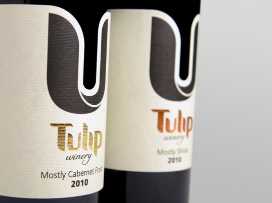
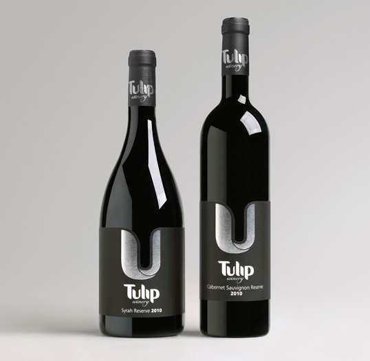
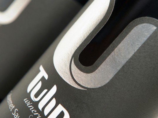
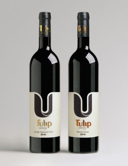
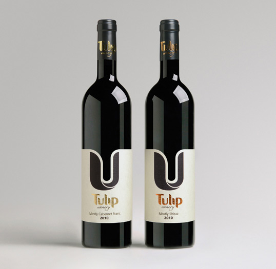
“A series of labels for Tulip winery, Israel. These premium wine bottles required prestigious labels, so the high quality of the products would reflect through them. In continuation to the new clean and minimalistic brand identity created a year ago, we chose a simple visual language with a single dominant graphic element. The letter “U” which also appears in the winery’s logo was originally designed so it would seem like the Tulip flower in reference to the brand name. Its unique shape generates a flowing and elegant contour and creates an aesthetic contrast between the light and dark shades on the bottle.”

Tulip Winery

Tulip Winery

Tulip Winery

Get the latest packaging design inspiration in your inbox:

Popular designs

Rebranding Mayawell: A Blend of Mexican Heritage and Healthy Living

Discover Mayawell, a Mexican-owned beverage company that celebrates its heritage with natural, organic, and prebiotic drinks. The rebranding strikes a balance between traditional elements and contemporary design, offering a unique, healthy alternative to traditional sodas.

Dama Blanca: Packaging Design for Salt of Cádiz

Discover the artisanal salt packaging design for Dama Blanca, a family project from Salinas of Cádiz. The design reflects the brand’s 3000-year history, authenticity and love for the sea, using natural materials and a sea-inspired palette.

Designed by: PepsiCo Design & Innovation
Country: United States

Tulip Winery

lovely-package-tulip-1

Tulip Winery

Designed by Israel Yosseph | Country: Israel

“A series of labels for Tulip winery, Israel. These premium wine bottles required prestigious labels, so the high quality of the products would reflect through them. In continuation to the new clean and minimalistic brand identity created a year ago, we chose a simple visual language with a single dominant graphic element. The letter “U” which also appears in the winery’s logo was originally designed so it would seem like the Tulip flower in reference to the brand name. Its unique shape generates a flowing and elegant contour and creates an aesthetic contrast between the light and dark shades on the bottle.”
Tulip Winery

Tulip Winery

Tulip Winery

Previous slide
Next slide
Get the latest on packaging design in your inbox: