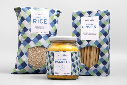
Designed by Studio Fusentast | Country: Norway
“A family run business from the harbour town of Genova, making and distributing organic food. A pattern with a distinct color scheme inspired by the sea is consistently used on all packaging, making it easy to recognise. The labels are kept simple, yet informative, and the typefaces chosen are inspired by Italian culture. The crest used in the logo and on the packaging is to emphasize the family aspect.”