Designed by: PepsiCo Design & Innovation
Country: United States

Westerham Brewery

Westerham Brewery

Designed by D. Studio | Country: United Kingdom

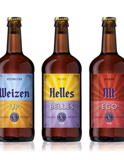
“The Westerham Brewery is one of Kent’s finest craft brewers, producing exceptional real ales from locally sourced ingredients.

In partnership with their German friend and master brewer Markus Lotz, the Westerham Brewery brought together the best of each country’s brewing processes to create a range of German style beers.

D. Studio came up with the strapline ‘German beer, Kent accent’ to reflect the coming together of the two great brewing nations. This idea was reflected in the label design with the top half featuring hand crafted German blackletter script and border styling whilst the bottom half was a more English affair.

D. Studio also created the names for the beers, which further expressed the idea and communicated the style of each beer with an anglo-German play on words.”

Get the latest packaging design inspiration in your inbox:

Popular designs

Pure Persian Honey

When we look closely at honey packaging, they are almost all in the usual format, and the ultimate in creativity is that

Burma Love Rebrand

Love at First BiteAs an extension of the Burma Superstar restaurant in San Francisco, Burma Love Foods gives diners an opportunity to

The Port Vodka Lemon Water

Overview: In response to my client’s vision for a Cape Cod themed beverage brand, I embarked on the journey to create The Port

Far Out Bar

Description: Far Out Bar is a cutting-edge packaging design project created for High Life Farms’ macrodose THC chocolate bars. This project involved

Designed by: PepsiCo Design & Innovation
Country: United States

Westerham Brewery

lovely-package-westerham-brewery

Westerham Brewery

Designed by D. Studio | Country: United Kingdom

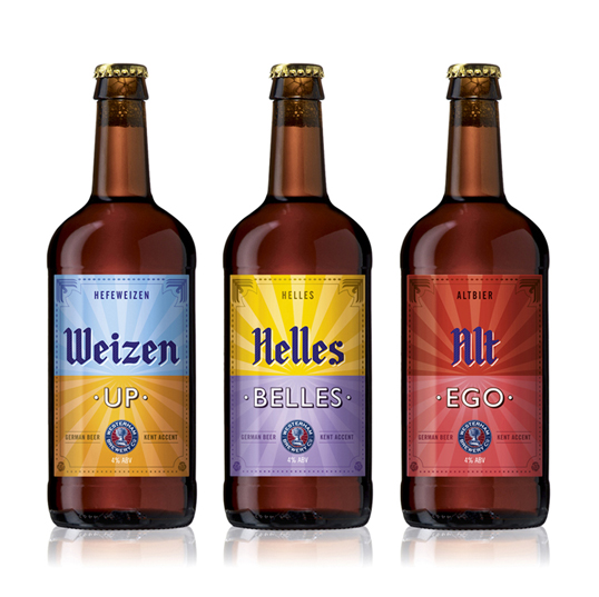
“The Westerham Brewery is one of Kent’s finest craft brewers, producing exceptional real ales from locally sourced ingredients.

In partnership with their German friend and master brewer Markus Lotz, the Westerham Brewery brought together the best of each country’s brewing processes to create a range of German style beers.

D. Studio came up with the strapline ‘German beer, Kent accent’ to reflect the coming together of the two great brewing nations. This idea was reflected in the label design with the top half featuring hand crafted German blackletter script and border styling whilst the bottom half was a more English affair.

D. Studio also created the names for the beers, which further expressed the idea and communicated the style of each beer with an anglo-German play on words.”

Previous slide
Next slide

Explore more great package design

Get the latest on packaging design in your inbox: