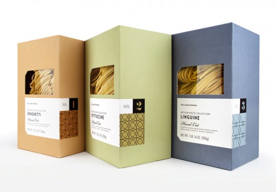
Designed by Williams-Sonoma Brand Packaging Dept. | Country: United States
“As part of the new ‘pantry essentials’ line of products within the Williams-Sonoma stores, this package was meant to be a modern interpretation of simple and classic pasta packaging. The intention was for it to feel high-end and artisanally crafted to highlight the single origin nature of the semolina flour used to made this hand-cut pasta.”