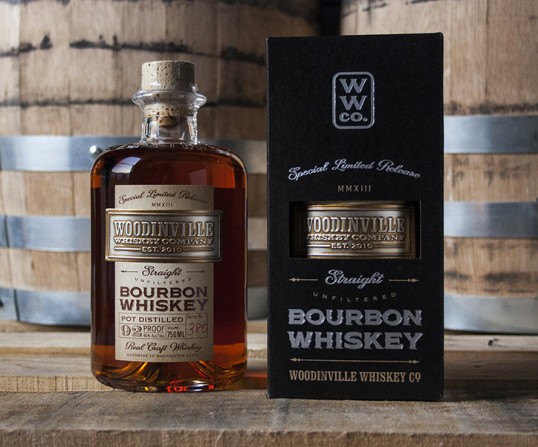
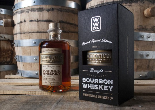
Designed by David Cole Creative | Country: United States
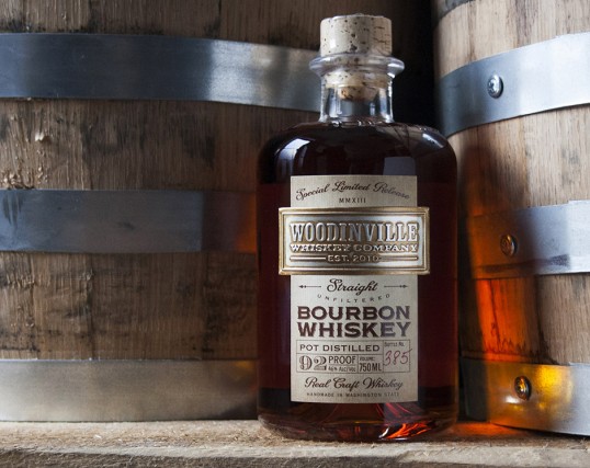
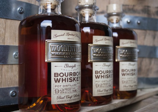
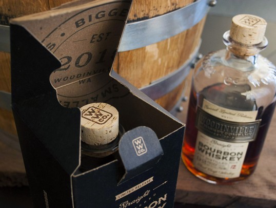
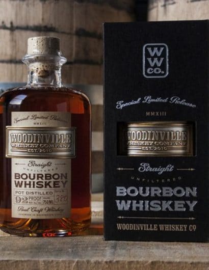
“I am proud to work with Woodinville Whiskey Company. They are producing some fantastic spirits and they’re doing it with soul – and lots of local flavor (not to mention local grains). This project included an original label and carton design for their first ever straight bourbon. It’s a special moment for a young distillery to release their first straight whiskey – it takes years of patience and there’s no shortcutting it. I took the same approach on the package design.”
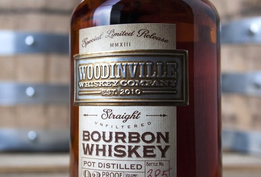
“This has been a multi-faceted and multi-dimensional process. A great many paper samples, materials swatches, ink chips, and process tests have exchanged hands. The local printers and vendors we’re working with are doing an outstanding job helping us keep the production quality as high as the vision demands.
The label and carton design are intended to convey the brand’s key attributes. This is a serious, classic, American whiskey – but these guys aren’t from Kentucky. Still, there’s some common ground to be found between the rugged pioneer spirit that brought settlers to the Pacific Northwest and the well-known and proud tradition of whiskey making in Kentucky. It’s hard to articulate in a few sentences, but after a few sips and some soul searching with Owner/Distillers Orlin Sorensen and Brett Carlile, we were on the same page with where this brand is coming from – and where it’s going. In short, they are approachable, respectable, warm, traditional, scrappy, self-made, unpretentious and proud – all at the same time.”

