Designed by: PepsiCo Design & Innovation
Country: United States

XXXX Summer Bright Lager

summer

Designed by Di Donato | Country: Australia

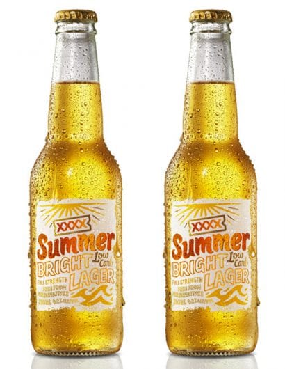
“The XXXX Summer Bright Lager brand evolved from an innovation program designed to establish a new brand within the full strength low-carbohydrate Australian market. The coastal attitude and relaxed style of the identity and packaging has been inspired by the authenticity of the XXXX Trademark. XXXX has a strong affiliation with Summer in Australia and what better way to celebrate Australian lifestyle than a beer brewed specifically for a hot climate and an energised beach culture.

The design is original and hand illustrated, inspired by Australian beach, and beach culture aesthetic – informal, warm and unconventional. True to the XXXX values and approach to life, the identity narrative brings to life a positive reflection of life –  playing under the great Australian sun.

The technical merits of the packaging feature a bottle with a high-build textured varnish (representative of sand) on a pressure sensitive label.”

Get the latest packaging design inspiration in your inbox:

Popular designs

Innovative Design and Packaging of Teeling Whiskey Crystal Malt

Explore the innovative packaging design of Teeling Whiskey Crystal Malt. A dark screen printed bottle with a Marque™ aluminum label, textural dimension, and a seamless diamond pattern, embodies the brand’s commitment to unconventional expressions.

Designed by: PepsiCo Design & Innovation
Country: United States

XXXX Summer Bright Lager

summer

summer

Designed by Di Donato | Country: Australia

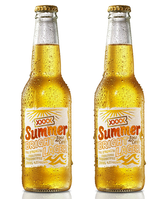
“The XXXX Summer Bright Lager brand evolved from an innovation program designed to establish a new brand within the full strength low-carbohydrate Australian market. The coastal attitude and relaxed style of the identity and packaging has been inspired by the authenticity of the XXXX Trademark. XXXX has a strong affiliation with Summer in Australia and what better way to celebrate Australian lifestyle than a beer brewed specifically for a hot climate and an energised beach culture.

The design is original and hand illustrated, inspired by Australian beach, and beach culture aesthetic – informal, warm and unconventional. True to the XXXX values and approach to life, the identity narrative brings to life a positive reflection of life –  playing under the great Australian sun.

The technical merits of the packaging feature a bottle with a high-build textured varnish (representative of sand) on a pressure sensitive label.”

Previous slide
Next slide
Get the latest on packaging design in your inbox: