Designed by: PepsiCo Design & Innovation
Country: United States

Yorkshire Dales Meat Co.

yorkshire1

Designed by Robot-food | Country: United Kingdom

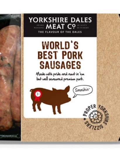
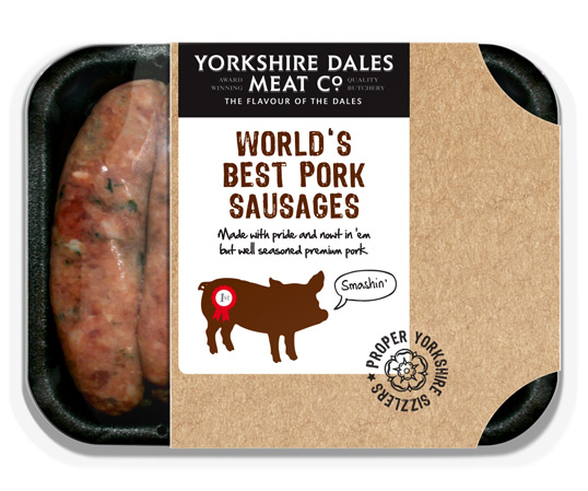
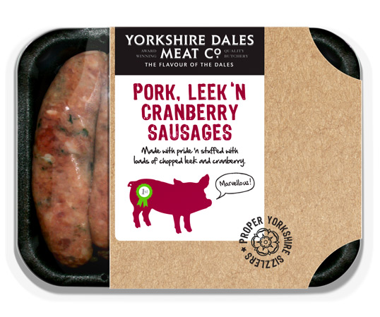
“Yorkshire Dales Meat Company is a supplier of fine meat products to catering and they also produce a range of premium sausages to supply supermarkets. Their current sausage pack is wrapped in film with an almost unbranded white sticker applied. They approached us to look at packaging design concepts to increase their supermarket distribution, shelf shout and sales volume.

Without a brief we decided to offer them a new identity that would look proud and longstanding to back up the trade side of the business,  while also appearing honest and trustworthy in a supermarket environment. The packaging itself is a simple white card sleeve, printed to look like brown card with a white sticker and stamp on it, in order to keep cost down. We focused on the Yorkshire heritage and wanted to show the product as no nonsense “proper Yorkshire sizzlers”, which is where the cheeky pig and tone of voice comes in. We felt that the contrast of the card and white background gives a farmers market, fresh feel, while showing off the product on display.”
yorkshire2

Get the latest packaging design inspiration in your inbox:

Popular designs

Harry Brompton’s Iced Tea Unveils New Packaging Design by Gency

Discover the vibrant new look of Harry Brompton’s Iced Tea, masterfully redesigned by Gency, and taste the summer with the introduction of their refreshing new Summer Berries flavour. Dive into a world where design meets deliciousness and experience the finest RTD tea.

Designed by: PepsiCo Design & Innovation
Country: United States

Yorkshire Dales Meat Co.

yorkshire1

yorkshire1

Designed by Robot-food | Country: United Kingdom

“Yorkshire Dales Meat Company is a supplier of fine meat products to catering and they also produce a range of premium sausages to supply supermarkets. Their current sausage pack is wrapped in film with an almost unbranded white sticker applied. They approached us to look at packaging design concepts to increase their supermarket distribution, shelf shout and sales volume.

Without a brief we decided to offer them a new identity that would look proud and longstanding to back up the trade side of the business,  while also appearing honest and trustworthy in a supermarket environment. The packaging itself is a simple white card sleeve, printed to look like brown card with a white sticker and stamp on it, in order to keep cost down. We focused on the Yorkshire heritage and wanted to show the product as no nonsense “proper Yorkshire sizzlers”, which is where the cheeky pig and tone of voice comes in. We felt that the contrast of the card and white background gives a farmers market, fresh feel, while showing off the product on display.”

yorkshire2

Previous slide
Next slide
Get the latest on packaging design in your inbox: