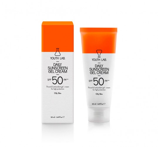
Designed by mousegraphics | Country: Greece
“Τhe brief: we want our high quality products to become the preferred choice for beauty concious women.
Τhe target audience: women who are well informed and prefer not to spend on highly advertised products.
The design: what we needed to convey through the identity and packaging design of this range of products was trust and intimacy. It targets women within the very environment of beauty care and we decided to make this environment part of the design concept. Youth Lab is, by language and symbol choice, a straightforward reference to a personal laboratory, a place where each individual is treated specially and with the proper, tested materials. The retro futuristic character of the lab tube and the thin, elongated type font speaks of scientific seriousness, while the choice of fluorescent colors on rough carton paper, suggests calculated boldness and personality. The result is a product that is familiar but not boring, trustworthy but also linked with research and experimentation.”