Designed by Blue Marlin | Country: United Kingdom
“‘Wonderfully unusual’ non-alcoholic adult beverage ZEO has been given a spectacular brand expression by integrated brand design agency Blue Marlin.
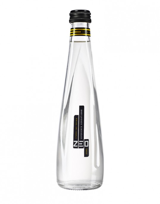
“The flowing form of our structural design plays with your senses, like ZEO itself. Its curious curves unpredictably refract light, enigmatically disguising the physical shape of the bottle in a low-lit bar or nightclub setting. The intangibility of the new design encapsulates ZEO’s mysterious mixology and unique sensorial effects in a bottle,” says Blue Marlin’s head of structure, Guy Williams.
“We kept the design simple, to allow ZEO’s unique bottle shape to do the talking,” explains Blue Marlin London creative director Simon Pendry, “The minimalistic black, gold and white graphic design gleams with sophistication, communicating essential information with perfectly premium appeal.”