


AGENCY: Wedo Creative Solutions
COUNTRY: Armenia
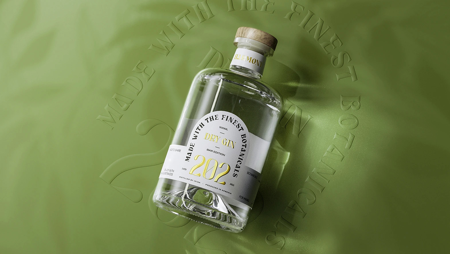
The central concept guiding the design of 202 Gin’s packaging was a deep connection with the natural world. The gin itself stands as a testament to this ethos, bringing together a symphony of 12 carefully chosen botanicals, each with its own unique flavor profile. These botanicals were not randomly selected; they were chosen with great care to create a harmonious and flavorful blend.


To bring this botanical symphony to life, the design team chose to use hand-drawn illustrations. These illustrations served as windows into the natural world, portraying the very ingredients that made their gin special. Every botanical was carefully and lovingly rendered with intricate detail.
For instance, the juniper’s unique aroma, reminiscent of pine forests, was captured in the illustrations. The vivacity of basil and the elegance of hibiscus were brought forth in a way that made onlookers feel as if they were wandering through a garden. To add a touch of the exotic, a tropical vibe was infused into these illustrations, evoking the feeling of a distant paradise.
Colors played a vital role in the packaging design. The main colors chosen—reminiscent of pickle, olive, canary, and gold—complemented the natural richness of the botanicals. They added vibrancy and depth to the packaging, making it both visually striking and harmonious.
Packaging serves as a visual representation of the brand’s identity and values. It helps establish the brand’s personality, whether it’s classic, modern, luxurious, or artisanal. Additionally, it provides an opportunity to tell the brand’s story and showcase the product’s unique selling points. Elements like illustrations, typography, and color choices can convey the history, ingredients, and craftsmanship behind the gin. Collecting uniquely designed gin bottles has evolved into a beloved hobby for numerous enthusiasts. In this context, it is firmly believed that the 202 GIN bottle stands out as an exceptional addition to any collector’s collection.


