Designed by Force & Form | Country: United States
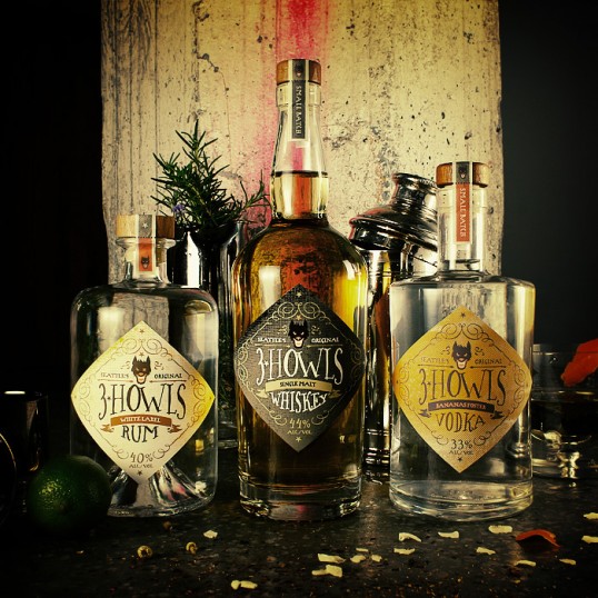
“Force & Form was commissioned to create an idiosyncratic brand identity for a new distillery, one that could blend Old World traditions with the creative vibe of Seattle’s SODO district—which the distillery calls home. We named, branded and packaged the distillery “3 Howls” as an homage to a British legend. As the tale goes, Hell’s hound howls 3 times before dragging revelers to the Underworld. The dog’s color varies from village to village, from victim to victim—but their fate remains the same. While 3 Howls’ spirits won’t drag you to hell, they are attracted to revelers. Hand lettering reinforces the handcrafted, small batch nature of the brand positioning, as well as the gritty terroir of the Distillery’s home. Traditional typographic structures and calligraphic flourishes honor distilling’s rich visual history. The diamond-shaped dieline maximizes shelf pop and unifies the brand across 3 traditional bottles. The result is gritty neo-traditionalism—branding that fits into but stands out from the crowded Seattle distilling scene. 3 Howls is a blend of grit and finesse—authenticity and imagination.”