Designed by: PepsiCo Design & Innovation
Country: United States

+359 Wine

359_1

Designed by Jordan Jelev | Country: Bulgaria | Font: Bodoni Poster

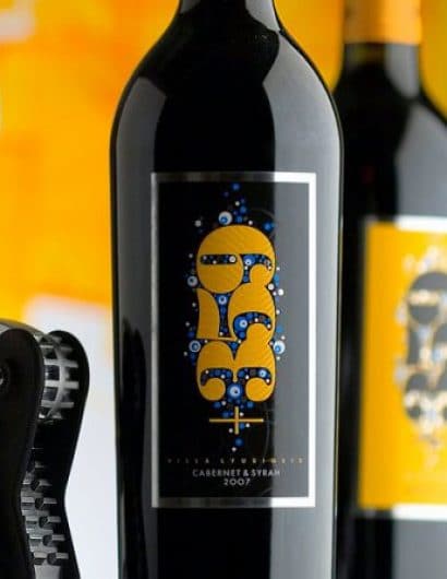
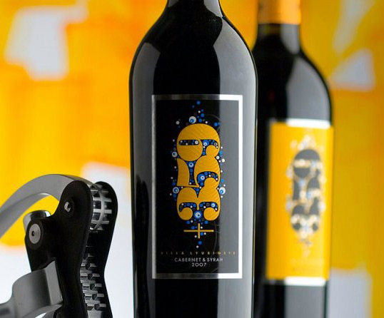
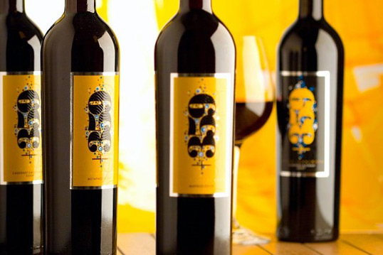
“The +359 brand name comes from the international phone code of Bulgaria which is +359. This brand identifies 100% with Bulgarians and it is very popular in the country. The client wanted to change the look of the whole package into a vision that is more fresh, modern, colourful and absolutely distinguished.

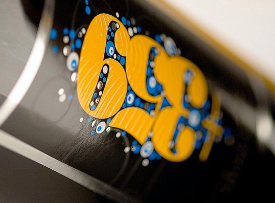
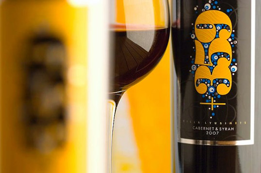
I decided to change the +359 logo as a start. I used Extra Black Poster Bodoni and changed it slightly to fit perfectly to my design. Poster Bodoni is well known to the audience. It is type often used by Bulgarian Post and I thought it would communicate well with the audience, and that they would feel willing to buy it.

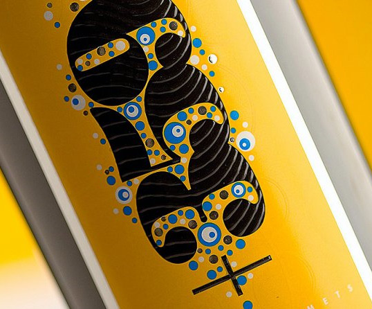
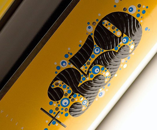
The rest of the label could be described as an effort to make it more fresh, colourful and glossy – hence the use of nice warm colours, the glittering silver hot foil dots and glossy inks. I also wanted consumers not only to see this label as an image, but to feel it and to sense it with their fingers. The use of puff-up transparent varnish makes a relief structure on the +359 logo. The cap of the bottle is very interesting too – it is a pattern of the +359 logo which is printed with transparent matte varnish on a glossy background that helps repeat the matte/gloss theme on the label”
359_2

359_3

359_4

359_5

359_6

359_7

Get the latest packaging design inspiration in your inbox:

Popular designs

Designed by: PepsiCo Design & Innovation
Country: United States

+359 Wine

359_1

359_1

Designed by Jordan Jelev | Country: Bulgaria | Font: Bodoni Poster

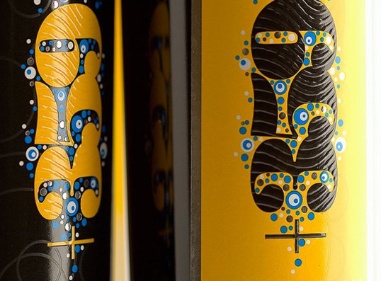
“The +359 brand name comes from the international phone code of Bulgaria which is +359. This brand identifies 100% with Bulgarians and it is very popular in the country. The client wanted to change the look of the whole package into a vision that is more fresh, modern, colourful and absolutely distinguished.

I decided to change the +359 logo as a start. I used Extra Black Poster Bodoni and changed it slightly to fit perfectly to my design. Poster Bodoni is well known to the audience. It is type often used by Bulgarian Post and I thought it would communicate well with the audience, and that they would feel willing to buy it.

The rest of the label could be described as an effort to make it more fresh, colourful and glossy – hence the use of nice warm colours, the glittering silver hot foil dots and glossy inks. I also wanted consumers not only to see this label as an image, but to feel it and to sense it with their fingers. The use of puff-up transparent varnish makes a relief structure on the +359 logo. The cap of the bottle is very interesting too – it is a pattern of the +359 logo which is printed with transparent matte varnish on a glossy background that helps repeat the matte/gloss theme on the label”
359_2

359_3

359_4

359_5

359_6

359_7

Explore more great package design

Get the latest on packaging design in your inbox: