Designed by: PepsiCo Design & Innovation
Country: United States

5 Seeds

5seeds1

Designed by Di Donato | Country: Australia

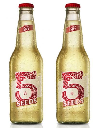
“The Tooheys Extra Dry 5 Seeds was an innovation program which encompassed all things beautiful about visual communication and identity development. The process was highly creative and strategically collaborative, allowing us to work from a powerful and unique Archetypal platform. The Visual Identity and packaging outcomes tell a story which illustrates both the functional product benefits (a crisp apple cider) and the mythical narrative of the Tree of Knowledge within the Garden of Eden.

The creation of the ‘5’ was inspired but biblical illuminated letters and has been has been illustrated and composed by hand. The broader identity system and packaging is designed to take the drinker on a journey of discovery – the semiotic integrity and aesthetic attention to detail has been paramount throughout the creative process.

The packaging has also achieved new heights in Australian alcoholic packaging standards with the use of an ultra high-build ink on a pressure sensitive label – designed to enhance the consumer ‘in-hand’ experience.”

Get the latest packaging design inspiration in your inbox:

Popular designs

The Bra Guru

Most women are wearing the wrong size bra and that is a fact. The Bra Guru® is the first and only professional

Over the wave

This Kombucha originates in Lombok, Indonesia, where its paradise beaches attract hundreds of surfers eager to ride the waves. When you surf,

Pure Persian Honey

When we look closely at honey packaging, they are almost all in the usual format, and the ultimate in creativity is that

Designed by: PepsiCo Design & Innovation
Country: United States

5 Seeds

5seeds1

5seeds1

Designed by Di Donato | Country: Australia

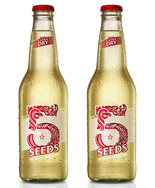
“The Tooheys Extra Dry 5 Seeds was an innovation program which encompassed all things beautiful about visual communication and identity development. The process was highly creative and strategically collaborative, allowing us to work from a powerful and unique Archetypal platform. The Visual Identity and packaging outcomes tell a story which illustrates both the functional product benefits (a crisp apple cider) and the mythical narrative of the Tree of Knowledge within the Garden of Eden.

The creation of the ‘5’ was inspired but biblical illuminated letters and has been has been illustrated and composed by hand. The broader identity system and packaging is designed to take the drinker on a journey of discovery – the semiotic integrity and aesthetic attention to detail has been paramount throughout the creative process.

The packaging has also achieved new heights in Australian alcoholic packaging standards with the use of an ultra high-build ink on a pressure sensitive label – designed to enhance the consumer ‘in-hand’ experience.”

Previous slide
Next slide

Explore more great package design

Get the latest on packaging design in your inbox: