Designed by Jon Patterson | Country: United States
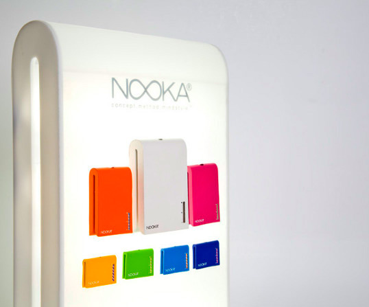
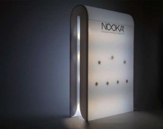
“The project involved a creation of a skincare line for an existing company, non-affiliated with skin products. I chose Nooka because of the idea of re-conceptualizing the current world we live in. The result is a reinvention of designing bottles that are functional for the urban cities most of the consumers live in. Bottles, although functional, need to be transportable/ and why shouldn’t they be wearable? On top of that, they must have purpose. I wanted to break the traditional rules of what skincare products are, and began to design what they should be.
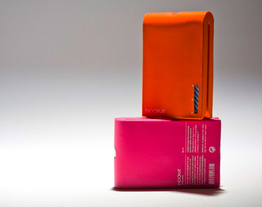
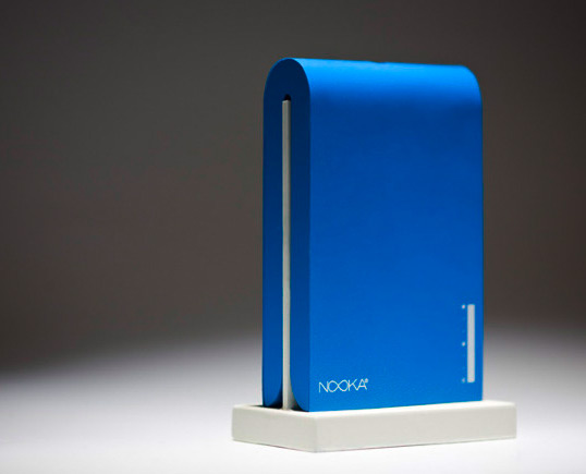
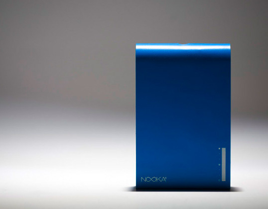
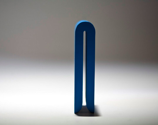
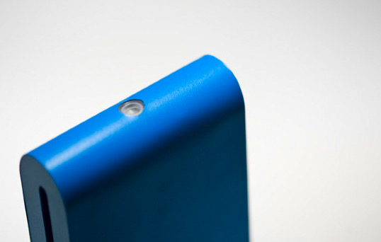
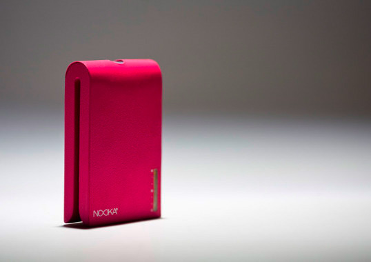
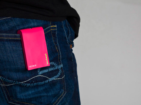
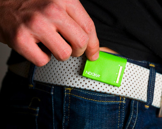
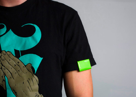
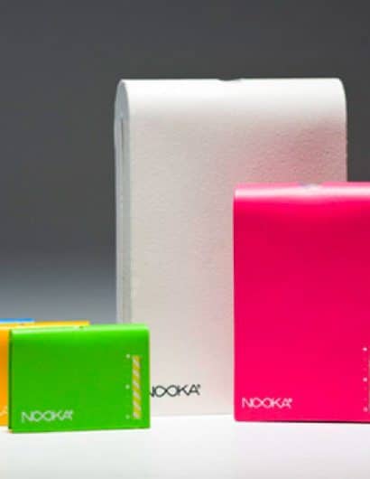
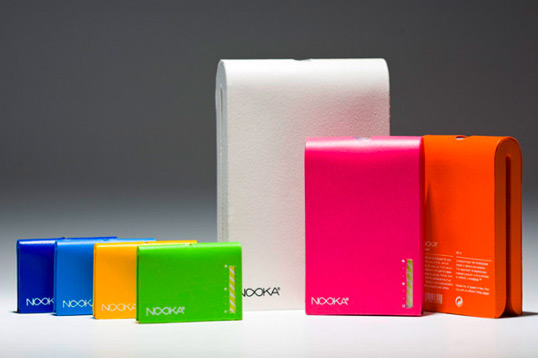
These bottles, ideally, would be a two piece injection molded plastic with a soft rubberized texture; similar to the silicon texture most of the products have. The spout/top, uses simple “o-ring” technology, similar to that of a heinz ketchup bottle. What this allows is less waste of the product, as well as a non-mess solution to traditional bottle tops. The bottles come in three sizes, with the middle size and smallest sizes both airport transportable coming under 3 oz. The functionality of the design allows the bottle to “clip” onto essentially any surface (such as belts, purses, shirts, pockets, shower racks.) What this allows is a bottle that can clip anywhere and be functional to the user (no more holding a sunscreen bottle while on the go or keeping bulky Purell containers in your pockets). The stripes shown on the front of the bottle are indicators and tell the user when they are low on the product, using a color hit to get their attention. The products for this project were, Sunblock, Body Wash and Hand Sanitizer. I noticed that Purell, and all other hand sanitizers, come in the common bottles, but they are bulky, and rather nerdy in my opinion. The only other way to carry hand sanitizer is to wear it around your neck, which is even more stupid! So the smaller bottle concept solves the issue, allowing the consumer to wear it as an accessory (that they already would do) allows them to add a little flair to their current style by wearing on their belt, etc. The bottle itself is re-useable. I wanted to do this not because it is trendy to be “green” but more because a lot of people, when asked, wanted something refillable. So the “O-ring” can be removed, and filled with product.
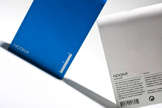
The bottles tell of no information on the front, however, once flipped the consumer can see what they are looking at. This concept is taken from the intrigue with these watches. The watches take time to learn/understand, but nonetheless, they draw interest and intrigue. This follows the same belief. We create a product that is very intriguing to the user, they grow curious and begin to examine the product more curiously. Also, being that the bottle colors with this concept don’t reflect the scent/product, there is no need to advertise on the front the product if it can be switched out.”
