Designed by: PepsiCo Design & Innovation
Country: United States

Student Work – José Luis García Eguiguren

barbasol1

Designed by José Luis García Eguiguren | Country: Spain

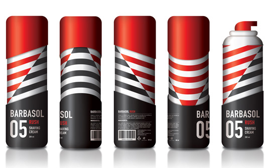
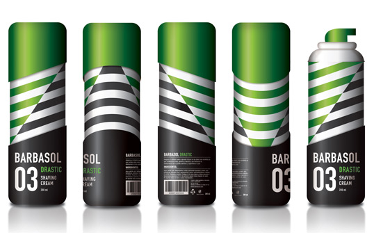
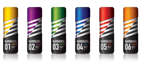
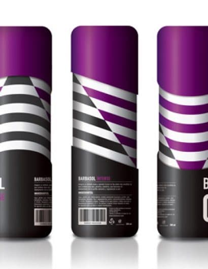
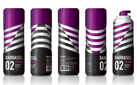
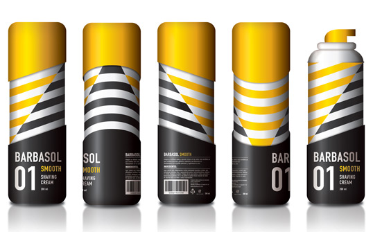
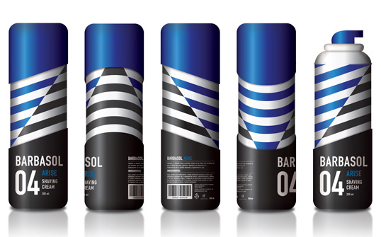
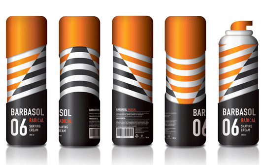
“This project’s objective was to re-style the popular American “Barbasol” shaving cream in order to introduced it into the European market. For this, I maintained the basic form that they have used for years: the barber shop pole (stripes). The aggressive diagonal line that divides the stripes suggest a mix between the shaving cream and the fragance. It also alludes to the razor blades on the surface of the skin cutting through the facial hair. The way the lines drive all the way up and down on the sides makes a perfect simulation of the shaving cream mixing and exiting the can. The form of the can (cap & bottom) are in harmony with the angle of the stripes, thus providing a fluid motion for the eye. The typography utilized provides a more industrial and tech appearance.”
barbasol2

barbasol3

barbasol4

barbasol5

barbasol6

barbasol7

Get the latest packaging design inspiration in your inbox:

Popular designs

Far Out Bar

Description: Far Out Bar is a cutting-edge packaging design project created for High Life Farms’ macrodose THC chocolate bars. This project involved

Pure Persian Honey

When we look closely at honey packaging, they are almost all in the usual format, and the ultimate in creativity is that

The Port Vodka Lemon Water

Overview: In response to my client’s vision for a Cape Cod themed beverage brand, I embarked on the journey to create The Port

Designed by: PepsiCo Design & Innovation
Country: United States

Student Work – José Luis García Eguiguren

barbasol1

barbasol1

Designed by José Luis García Eguiguren | Country: Spain

“This project’s objective was to re-style the popular American “Barbasol” shaving cream in order to introduced it into the European market. For this, I maintained the basic form that they have used for years: the barber shop pole (stripes). The aggressive diagonal line that divides the stripes suggest a mix between the shaving cream and the fragance. It also alludes to the razor blades on the surface of the skin cutting through the facial hair. The way the lines drive all the way up and down on the sides makes a perfect simulation of the shaving cream mixing and exiting the can. The form of the can (cap & bottom) are in harmony with the angle of the stripes, thus providing a fluid motion for the eye. The typography utilized provides a more industrial and tech appearance.”
barbasol2

barbasol3

barbasol4

barbasol5

barbasol6

barbasol7

Previous slide
Next slide

Explore more great package design

Get the latest on packaging design in your inbox: