Designed by: PepsiCo Design & Innovation
Country: United States

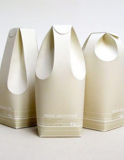
Milk Carton Concept

milk2

Designed by Raw Edges | Country: United Kingdom

An excellent example of structural package design applied in a f

unctional and communicative way.

“These three different milk cartons distinguish between the rates of fat in the milk by using form rather than colour. The form of the milk cartons reflects in a way on the milk’s texture and smoothness. The two back folds are used as the carton’s handle, while the two in the front function as the spout.”

zp8497586rq

Get the latest packaging design inspiration in your inbox:

Popular designs

The Bra Guru

Most women are wearing the wrong size bra and that is a fact. The Bra Guru® is the first and only professional

Over the wave

This Kombucha originates in Lombok, Indonesia, where its paradise beaches attract hundreds of surfers eager to ride the waves. When you surf,

The Port Vodka Lemon Water

Overview: In response to my client’s vision for a Cape Cod themed beverage brand, I embarked on the journey to create The Port

Burma Love Rebrand

Love at First BiteAs an extension of the Burma Superstar restaurant in San Francisco, Burma Love Foods gives diners an opportunity to

Designed by: PepsiCo Design & Innovation
Country: United States

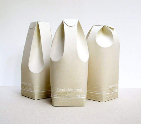
Milk Carton Concept

milk2

milk2

Designed by Raw Edges | Country: United Kingdom

An excellent example of structural package design applied in a f

unctional and communicative way.

“These three different milk cartons distinguish between the rates of fat in the milk by using form rather than colour. The form of the milk cartons reflects in a way on the milk’s texture and smoothness. The two back folds are used as the carton’s handle, while the two in the front function as the spout.”

zp8497586rq
Previous slide
Next slide

Explore more great package design

Get the latest on packaging design in your inbox: