Designed by: PepsiCo Design & Innovation
Country: United States

Lejonet & Björnen

Lejonet & Björnen ice cream

Designed by Motherland | Country: Sweden

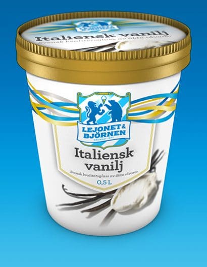
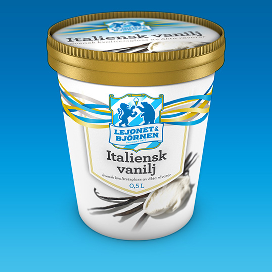
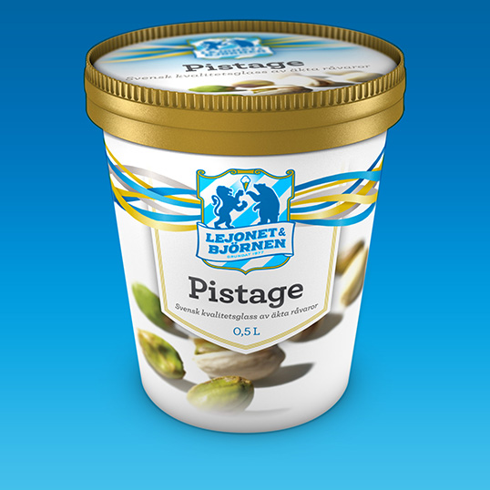
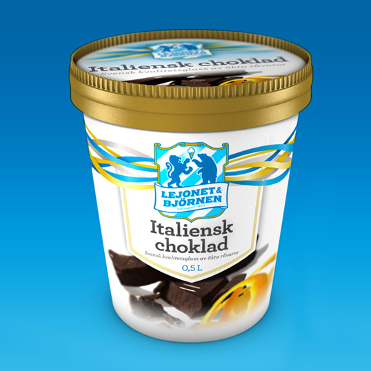
“Swedish brand Lejonet & Björnen has been producing premium ice cream since 1977. In 2009, Lejonet & Björnen’s new owners developed the brand further, among other things focusing more on being environmentally friendly and locally produced. In connection with this, the decision was made to recharge the brand to reflect this change.

The challenge with this rebranding was to keep as much as possible of the existing brand identity, and at the same time deliver a new, familiar but refined, brand experience. Tradition and heritage, paired with modernity and fresh thinking. The visual identity builds on and updates the heraldic theme of the brand’s old logotype, and combines this with modern colours and typography.”
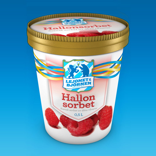
Lejonet & Björnen ice cream

Lejonet & Björnen ice cream

Lejonet & Björnen ice cream

Get the latest packaging design inspiration in your inbox:

Popular designs

Burma Love Rebrand

Love at First BiteAs an extension of the Burma Superstar restaurant in San Francisco, Burma Love Foods gives diners an opportunity to

The Port Vodka Lemon Water

Overview: In response to my client’s vision for a Cape Cod themed beverage brand, I embarked on the journey to create The Port

Over the wave

This Kombucha originates in Lombok, Indonesia, where its paradise beaches attract hundreds of surfers eager to ride the waves. When you surf,

Designed by: PepsiCo Design & Innovation
Country: United States

Lejonet & Björnen

Lejonet & Björnen ice cream

Lejonet & Björnen ice cream

Designed by Motherland | Country: Sweden

“Swedish brand Lejonet & Björnen has been producing premium ice cream since 1977. In 2009, Lejonet & Björnen’s new owners developed the brand further, among other things focusing more on being environmentally friendly and locally produced. In connection with this, the decision was made to recharge the brand to reflect this change.

The challenge with this rebranding was to keep as much as possible of the existing brand identity, and at the same time deliver a new, familiar but refined, brand experience. Tradition and heritage, paired with modernity and fresh thinking. The visual identity builds on and updates the heraldic theme of the brand’s old logotype, and combines this with modern colours and typography.”


Lejonet & Björnen ice cream

Lejonet & Björnen ice cream

Lejonet & Björnen ice cream

Previous slide
Next slide

Explore more great package design

Get the latest on packaging design in your inbox: