Designed by: PepsiCo Design & Innovation
Country: United States

Gleneagles Natural Mineral Water

Gleneagles Natural Mineral Water

Designed by 999 Design | Country: United Kingdom

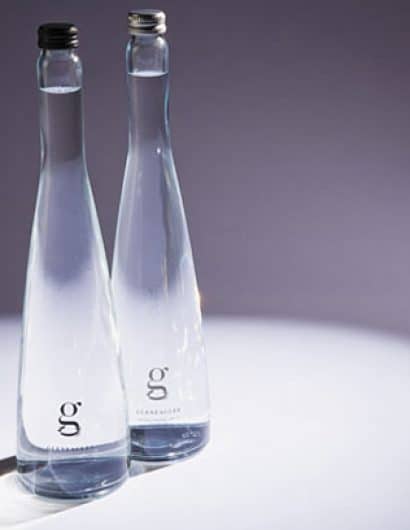
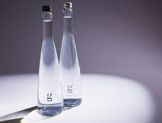
“We’ve now worked with Highland Spring for a number of years, packaging the UK’s leading bottled spring water, so when they asked us to create new packaging for Gleaneagles Natural Mineral Water, their elite mineral water product sold exclusively in the UK’s best hotels and restaurants, we thought we’d dive in.

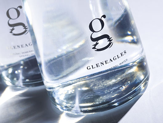
Gleneagles Water already has a distinctive, award winning and elegant glass bottle, so we set out to create quietly understated but complementary branding. And it had to be premium. The result was a beautifully simple lower ‘g’, it’s tail gently reflecting in the water. Wonderfully understated type underscored the new brand mark. The result a beautiful and timelessly elegant classic.”
Gleneagles Natural Mineral Water

Get the latest packaging design inspiration in your inbox:

Popular designs

Far Out Bar

Description: Far Out Bar is a cutting-edge packaging design project created for High Life Farms’ macrodose THC chocolate bars. This project involved

The Bra Guru

Most women are wearing the wrong size bra and that is a fact. The Bra Guru® is the first and only professional

Over the wave

This Kombucha originates in Lombok, Indonesia, where its paradise beaches attract hundreds of surfers eager to ride the waves. When you surf,

Designed by: PepsiCo Design & Innovation
Country: United States

Gleneagles Natural Mineral Water

gleneagles11

Gleneagles Natural Mineral Water

Designed by 999 Design | Country: United Kingdom

“We’ve now worked with Highland Spring for a number of years, packaging the UK’s leading bottled spring water, so when they asked us to create new packaging for Gleaneagles Natural Mineral Water, their elite mineral water product sold exclusively in the UK’s best hotels and restaurants, we thought we’d dive in.

Gleneagles Water already has a distinctive, award winning and elegant glass bottle, so we set out to create quietly understated but complementary branding. And it had to be premium. The result was a beautifully simple lower ‘g’, it’s tail gently reflecting in the water. Wonderfully understated type underscored the new brand mark. The result a beautiful and timelessly elegant classic.”

Gleneagles Natural Mineral Water

Previous slide
Next slide

Explore more great package design

Get the latest on packaging design in your inbox: