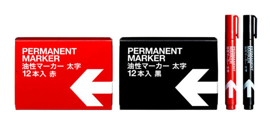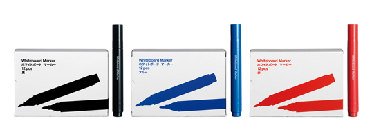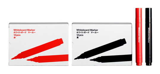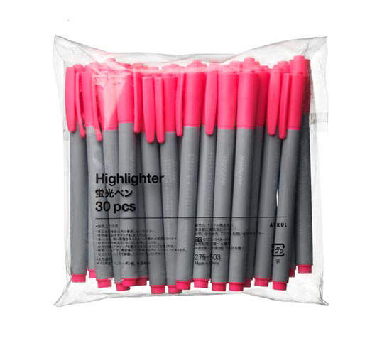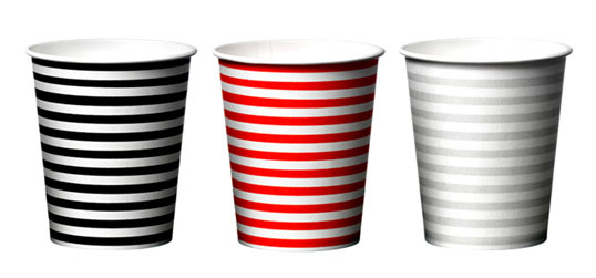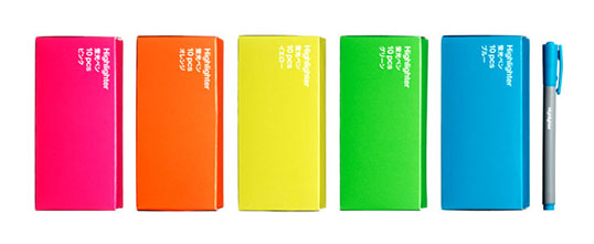
I love the simplicity of these designs and their use of bold type and colors. This system created by BVD is a fine example of where less is more.
“With Scandinavian design as a starting point the products’ common denominators are function, simp-
licity and clear communication. The typography has distinctive elements of colour and graphics, which makes the packaging eye-catching within both the extensive catalogue, and the home or office environment.”
