Designed by: PepsiCo Design & Innovation
Country: United States

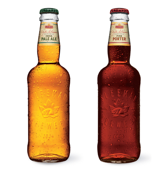
John Sleeman Presents Series

John Sleeman Presents Series

Designed by Dossier Creative | Country: Canada | Fonts used: Custom Script (Sunderland), Beaufort, Futura, Univers Ultra

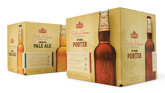
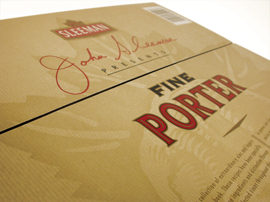
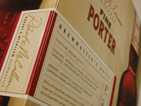
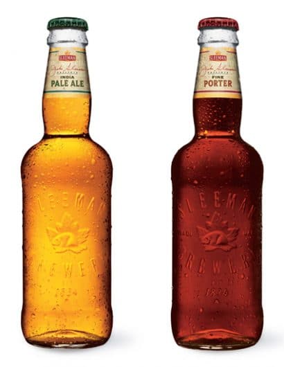
“Sleeman Breweries is one of Canada’s largest and oldest breweries; dating back to 1834 when John H. Sleeman established himself as a master brewer and a malter in Ontario. All natural ingredients and attention to quality have been the Sleeman hallmarks for five generations. Our challenge was to rebrand the John Sleeman Presents premier line of packaging – Fine Porter and Indian Pale Ale – to commemorate the founding father’s achievements and to reflect the brands time tested values of craftsmanship and brewing excellence. Our unique bottle and package design – a blend of old world and new world cues – not only reflects the sophistication and tradition of Sleeman, but also seemlessly ties in with the entire brand family. The clean and fresh design invites you to sample a historic and proudly Canadian beer of yesterday.”
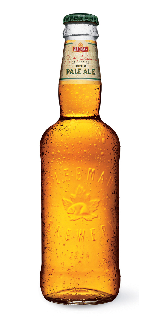
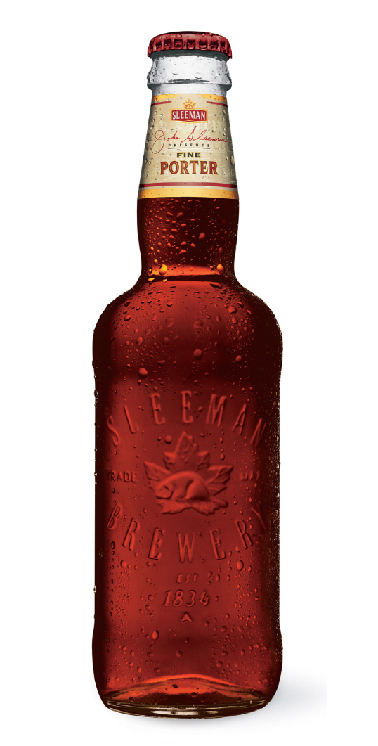
John Sleeman Presents Series

John Sleeman Presents Series

John Sleeman Presents Series

John Sleeman Presents Series

John Sleeman Presents Series

John Sleeman Presents Series

Get the latest packaging design inspiration in your inbox:

Popular designs

Over the wave

This Kombucha originates in Lombok, Indonesia, where its paradise beaches attract hundreds of surfers eager to ride the waves. When you surf,

Pure Persian Honey

When we look closely at honey packaging, they are almost all in the usual format, and the ultimate in creativity is that

Far Out Bar

Description: Far Out Bar is a cutting-edge packaging design project created for High Life Farms’ macrodose THC chocolate bars. This project involved

The Port Vodka Lemon Water

Overview: In response to my client’s vision for a Cape Cod themed beverage brand, I embarked on the journey to create The Port

Designed by: PepsiCo Design & Innovation
Country: United States

John Sleeman Presents Series

sleeman11

John Sleeman Presents Series

Designed by Dossier Creative | Country: Canada | Fonts used: Custom Script (Sunderland), Beaufort, Futura, Univers Ultra

“Sleeman Breweries is one of Canada’s largest and oldest breweries; dating back to 1834 when John H. Sleeman established himself as a master brewer and a malter in Ontario. All natural ingredients and attention to quality have been the Sleeman hallmarks for five generations. Our challenge was to rebrand the John Sleeman Presents premier line of packaging – Fine Porter and Indian Pale Ale – to commemorate the founding father’s achievements and to reflect the brands time tested values of craftsmanship and brewing excellence. Our unique bottle and package design – a blend of old world and new world cues – not only reflects the sophistication and tradition of Sleeman, but also seemlessly ties in with the entire brand family. The clean and fresh design invites you to sample a historic and proudly Canadian beer of yesterday.”
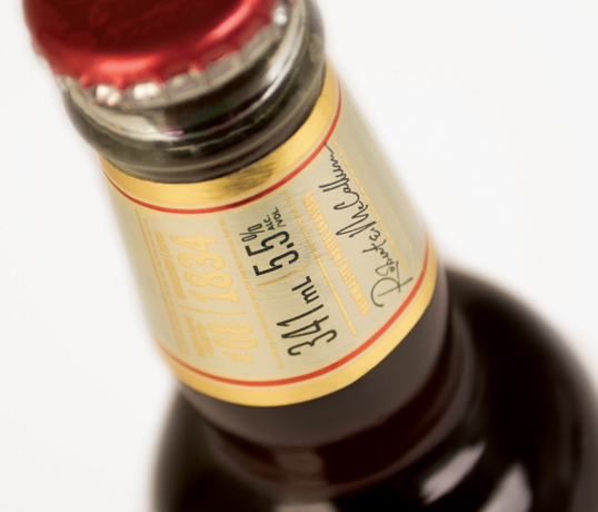
John Sleeman Presents Series

John Sleeman Presents Series

John Sleeman Presents Series

John Sleeman Presents Series

John Sleeman Presents Series

John Sleeman Presents Series

Previous slide
Next slide

Explore more great package design

Get the latest on packaging design in your inbox: