Designed by: PepsiCo Design & Innovation
Country: United States

Budgens

budgens

Designed by Pentagram | Country: United Kingdom

“Harry Pearce and his team have been commissioned to redesign the complete own brand range for Budgens and Londis stores.

The own brand range has three levels, Good, Better, and Best, and many of the redesigned Good Value range have already hit the shelves with Pentagram’s designs for Good Value Jaffa Cakes and Good Value Assorted Crisps winning the Quality Food Awards 2009.

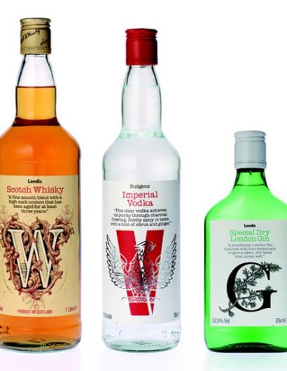
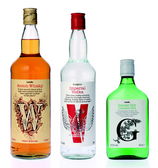
Now the first three varieties in the wines, beers and spirits range of Better products have been released with three sizes of bottle for the own brand whisky, gin and vodka. Each label takes a typographic approach with an individual letterform being adapted to capture the essence of the spirit inside. So the V of the vodka has a strong red constructivist feel with a silver foiled eagle set against it, the W of the whisky is foiled in gold against a faint thistle and the G of the gin is interlaced with a juniper branch replete with berries.

The text on each label adopts the same layout, which extends across all of Musgraves’ own brand products. It is expected that the whole redesign will take a year to roll out.”

Get the latest packaging design inspiration in your inbox:

Popular designs

Burma Love Rebrand

Love at First BiteAs an extension of the Burma Superstar restaurant in San Francisco, Burma Love Foods gives diners an opportunity to

Far Out Bar

Description: Far Out Bar is a cutting-edge packaging design project created for High Life Farms’ macrodose THC chocolate bars. This project involved

Designed by: PepsiCo Design & Innovation
Country: United States

Budgens

budgens

budgens

Designed by Pentagram | Country: United Kingdom

“Harry Pearce and his team have been commissioned to redesign the complete own brand range for Budgens and Londis stores.

The own brand range has three levels, Good, Better, and Best, and many of the redesigned Good Value range have already hit the shelves with Pentagram’s designs for Good Value Jaffa Cakes and Good Value Assorted Crisps winning the Quality Food Awards 2009.

Now the first three varieties in the wines, beers and spirits range of Better products have been released with three sizes of bottle for the own brand whisky, gin and vodka. Each label takes a typographic approach with an individual letterform being adapted to capture the essence of the spirit inside. So the V of the vodka has a strong red constructivist feel with a silver foiled eagle set against it, the W of the whisky is foiled in gold against a faint thistle and the G of the gin is interlaced with a juniper branch replete with berries.

The text on each label adopts the same layout, which extends across all of Musgraves’ own brand products. It is expected that the whole redesign will take a year to roll out.”

Previous slide
Next slide

Explore more great package design

Get the latest on packaging design in your inbox: