Designed by: PepsiCo Design & Innovation
Country: United States

Naked King

0

king1

Designed by BeetRoot Design Group | Country: Greece

Brief: a new winemaker contacted us in order to provide a visual identity to their new wine. The wine is of extremely high quality, but free from any filtering or chemical treatments So it sits there exposed, without any chemical aid for the consumer to taste it.
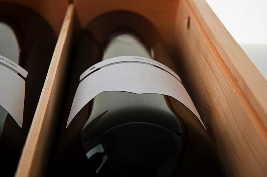
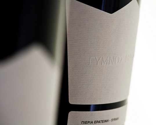
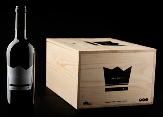
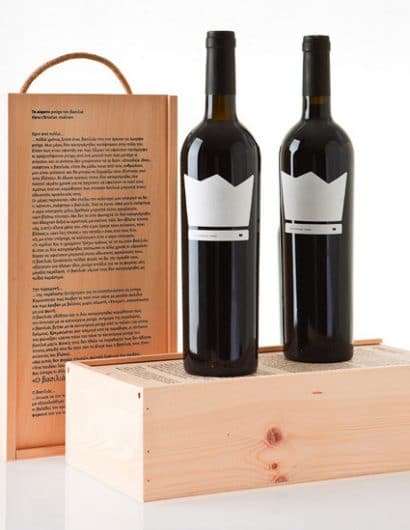
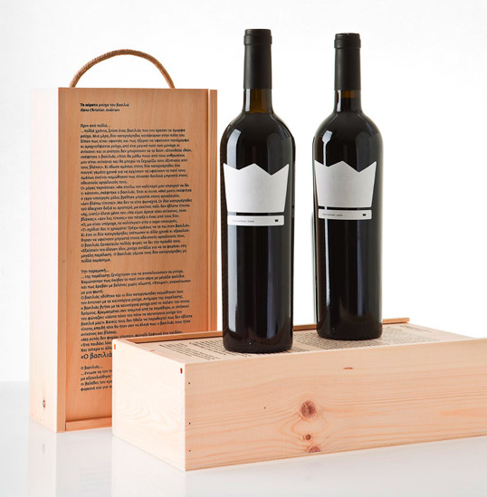
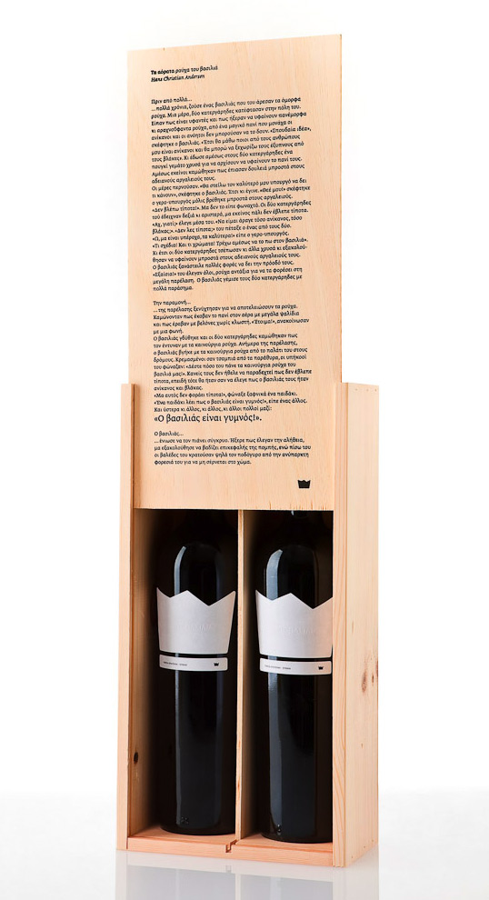
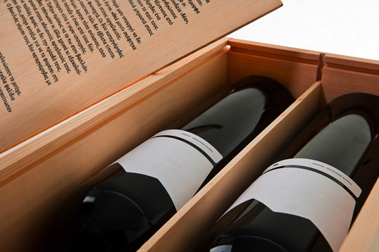
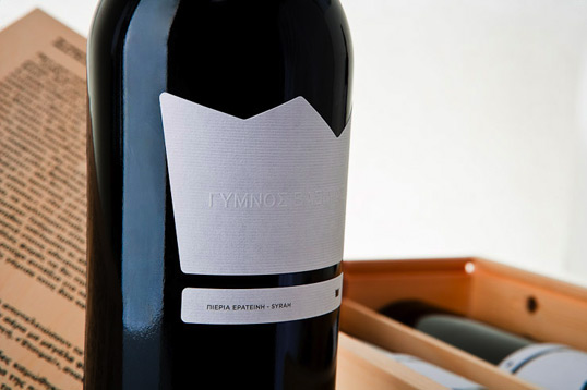
Solution: “you could say that it was the king of wines …but a sincere one.”  the client said. That reminded us of the Hans Christian Andersen tale “The Emperor’s clothes” where the king sits naked and exposed for everyone to see who he really was. So we decided to name the wine “NAKED KING”. In order to visually present that, we designed the label of the bottle shaped like a crown and embossed the title NAKED KING instead of printing it. We wanted to show that way it would seem like a naked king, without anything on. For the wooden box we silk printed in the front the tale with big type like in a child book and highlighted the words “The king is naked”.
king3

king4

king5

king6

king7

king8

0

Get the latest packaging design inspiration in your inbox:

Popular designs

The Bra Guru

Most women are wearing the wrong size bra and that is a fact. The Bra Guru® is the first and only professional

Over the wave

This Kombucha originates in Lombok, Indonesia, where its paradise beaches attract hundreds of surfers eager to ride the waves. When you surf,

Designed by: PepsiCo Design & Innovation
Country: United States

Naked King

0
king1

king1

Designed by BeetRoot Design Group | Country: Greece

Brief: a new winemaker contacted us in order to provide a visual identity to their new wine. The wine is of extremely high quality, but free from any filtering or chemical treatments So it sits there exposed, without any chemical aid for the consumer to taste it.

Solution: “you could say that it was the king of wines …but a sincere one.”  the client said. That reminded us of the Hans Christian Andersen tale “The Emperor’s clothes” where the king sits naked and exposed for everyone to see who he really was. So we decided to name the wine “NAKED KING”. In order to visually present that, we designed the label of the bottle shaped like a crown and embossed the title NAKED KING instead of printing it. We wanted to show that way it would seem like a naked king, without anything on. For the wooden box we silk printed in the front the tale with big type like in a child book and highlighted the words “The king is naked”.
king3

king4

king5

king6

king7

king8

0
Previous slide
Next slide

Explore more great package design

Get the latest on packaging design in your inbox: