Designed by: PepsiCo Design & Innovation
Country: United States

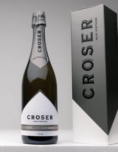
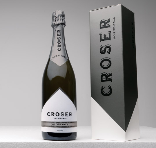
Crosser Non-Vintage

crosser1

Designed by War Design | Country: Australia

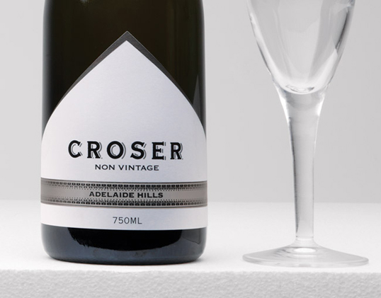
“Crosser Vintage launched 25 years ago and has established itself as a premium Australian Sparkling. Lion Nathan approached War to develop a Crosser Non-Vintage label that retained the equity of the Vintage brand whilst positioning the Non-Vintage at a lower price point to capture the fast growing ‘everyday sparkling’ market. The design retains everything synonymous with Crosser but through the use of colour and finishes clearly identifies it’s role in the Crosser family.”
crosser2

Get the latest packaging design inspiration in your inbox:

Popular designs

Innovative Mushroom-Based Packaging Used in Haircare Industry

Explore the sustainable revolution in the beauty industry, as haircare brand The Rootist partners with Morae and Evocative to create fully biodegradable and compostable packaging made from mushroom roots. An innovative solution for eco-friendly beauty essentials.

Laphroaig’s Wellington Boot-Inspired Gift Packaging Design

Laphroaig leverages story-telling to engage new drinkers, transforming the iconic green wellies into a giftable, reusable packaging for their single malt whisky. The wellie-inspired design disrupts traditional Scotch packaging, adding a playful touch to the brand’s history.

D’eyras – Medrono & Olive Oil

What connects D´EYRAS, Medronho, and Olive Oil? They all hail from the same country: Portugal. These trees are indigenous to the region, serving as a testament to the bountiful and diverse Mediterranean flora.

Designed by: PepsiCo Design & Innovation
Country: United States

Crosser Non-Vintage

crosser1

crosser1

Designed by War Design | Country: Australia

“Crosser Vintage launched 25 years ago and has established itself as a premium Australian Sparkling. Lion Nathan approached War to develop a Crosser Non-Vintage label that retained the equity of the Vintage brand whilst positioning the Non-Vintage at a lower price point to capture the fast growing ‘everyday sparkling’ market. The design retains everything synonymous with Crosser but through the use of colour and finishes clearly identifies it’s role in the Crosser family.”

crosser2

Previous slide
Next slide
Get the latest on packaging design in your inbox: