Designed by: PepsiCo Design & Innovation
Country: United States

Crispy Food

1

crispy1

Designed by envision:design | Country: Denmark | Font used: Gill Sans

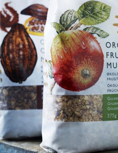
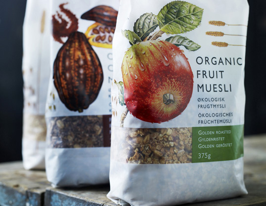
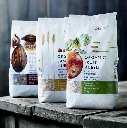
Crispy Food markets muesli with two simple demands: its contents have to be ecological and it has to taste great. envision:design got the assignment to express these two things in a concept and design packaging for the European market. The concept: “Muesli: the way it was meant to be” was the basis for design and communication. The design is based on traditional English textbook illustrations of the ingredients. This adds originality and emphasizes the ecological aspect without being boring. These componets are put into a light and simple Scandinavian design universe that challenges the way consumers are used to seeing muesli in the supermarkets. The illustrations are made by the British illustrator Roger Kent and Danish Illustrator Susanne Weitemeyer.
crispy2

1

Get the latest packaging design inspiration in your inbox:

Popular designs

Over the wave

This Kombucha originates in Lombok, Indonesia, where its paradise beaches attract hundreds of surfers eager to ride the waves. When you surf,

The Bra Guru

Most women are wearing the wrong size bra and that is a fact. The Bra Guru® is the first and only professional

Designed by: PepsiCo Design & Innovation
Country: United States

Crispy Food

1
crispy1

crispy1

Designed by envision:design | Country: Denmark | Font used: Gill Sans

Crispy Food markets muesli with two simple demands: its contents have to be ecological and it has to taste great. envision:design got the assignment to express these two things in a concept and design packaging for the European market. The concept: “Muesli: the way it was meant to be” was the basis for design and communication. The design is based on traditional English textbook illustrations of the ingredients. This adds originality and emphasizes the ecological aspect without being boring. These componets are put into a light and simple Scandinavian design universe that challenges the way consumers are used to seeing muesli in the supermarkets. The illustrations are made by the British illustrator Roger Kent and Danish Illustrator Susanne Weitemeyer.

crispy2

1
Previous slide
Next slide

Explore more great package design

Get the latest on packaging design in your inbox: