Designed by: PepsiCo Design & Innovation
Country: United States

Swiss & Global

swiss1

Designed by f-o-r-m-e | Country: Italy

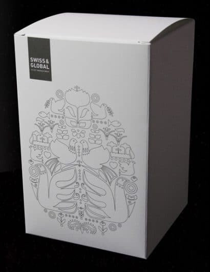
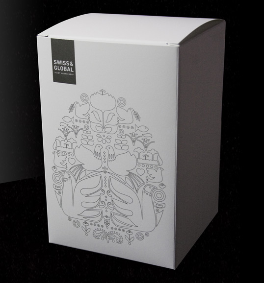
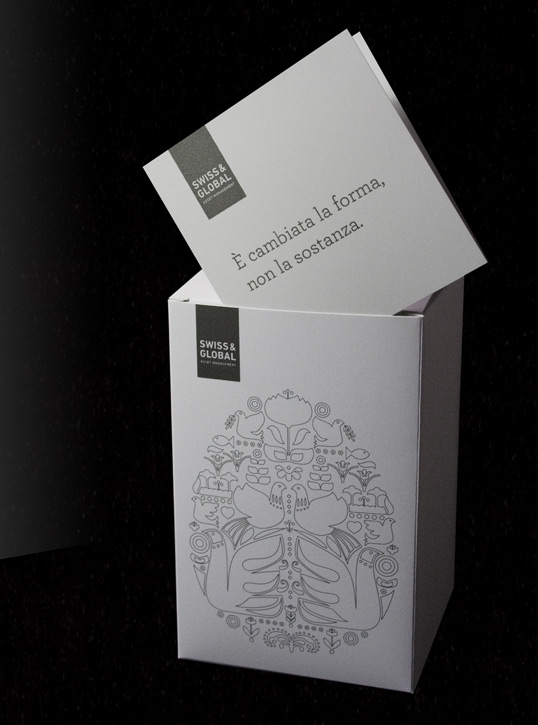
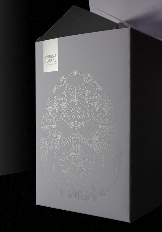
“We designed this package for our client Swiss & Global Asset Management. They are dedicated asset managers in Switzerland and worldwide and every year they make a little Easter present for their clients. They usually send some particular sweets from Sicily and we usually create a very simple package for them. On October 2009 they changed their company name – formerly Julius Baer Asset Management – so they decided to use the gift to communicate to their clients that the company name changed, but not the quality of their service. We decided to change the package to support this really important concept. We used a very beautiful kind of paper, Arjowiggins Skin, and a very refined illustration. All printed in Pantone Silver. We also used a “more vertical” form so that you think – also because of the illustration – that you’ll can find a chocolate egg inside. But when you open the package you find a card saying you ‘E’ cambiata la forma, non la sostanza’ (The form has changed, not the substance).”
swiss2

swiss3

Get the latest packaging design inspiration in your inbox:

Popular designs

Burma Love Rebrand

Love at First BiteAs an extension of the Burma Superstar restaurant in San Francisco, Burma Love Foods gives diners an opportunity to

Designed by: PepsiCo Design & Innovation
Country: United States

Swiss & Global

swiss1

swiss1

Designed by f-o-r-m-e | Country: Italy

“We designed this package for our client Swiss & Global Asset Management. They are dedicated asset managers in Switzerland and worldwide and every year they make a little Easter present for their clients. They usually send some particular sweets from Sicily and we usually create a very simple package for them. On October 2009 they changed their company name – formerly Julius Baer Asset Management – so they decided to use the gift to communicate to their clients that the company name changed, but not the quality of their service. We decided to change the package to support this really important concept. We used a very beautiful kind of paper, Arjowiggins Skin, and a very refined illustration. All printed in Pantone Silver. We also used a “more vertical” form so that you think – also because of the illustration – that you’ll can find a chocolate egg inside. But when you open the package you find a card saying you ‘E’ cambiata la forma, non la sostanza’ (The form has changed, not the substance).”

swiss2

swiss3

Previous slide
Next slide

Explore more great package design

Get the latest on packaging design in your inbox: