Designed by: PepsiCo Design & Innovation
Country: United States

Solberg & Hansen

Solberg & Hansen

Designed by Anti Design | Country: Norway

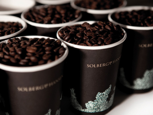
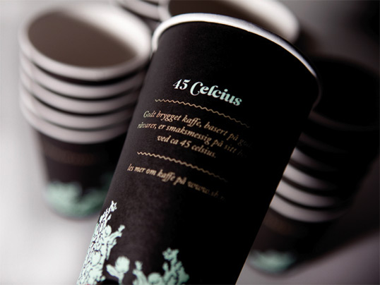
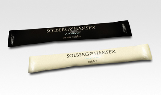
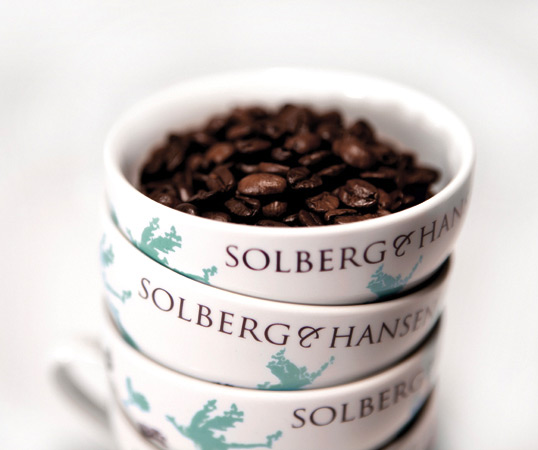
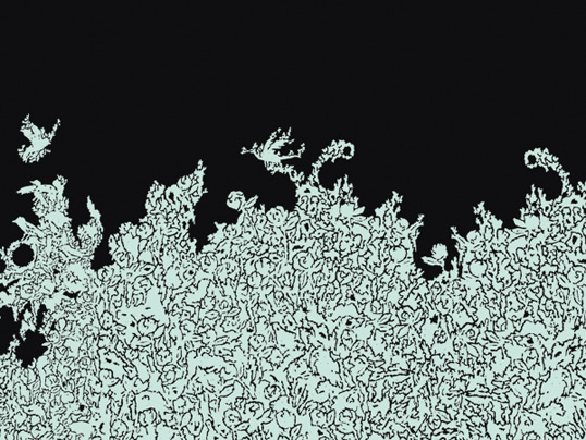
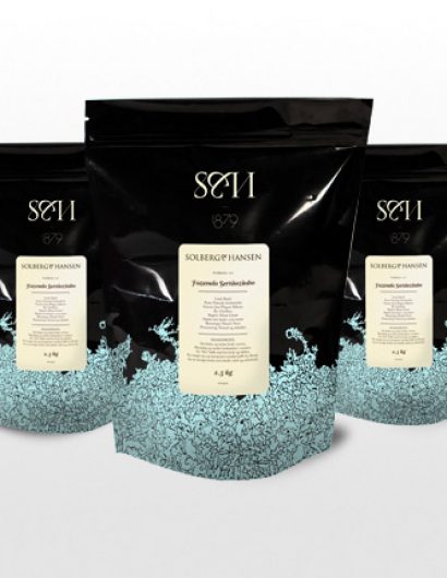
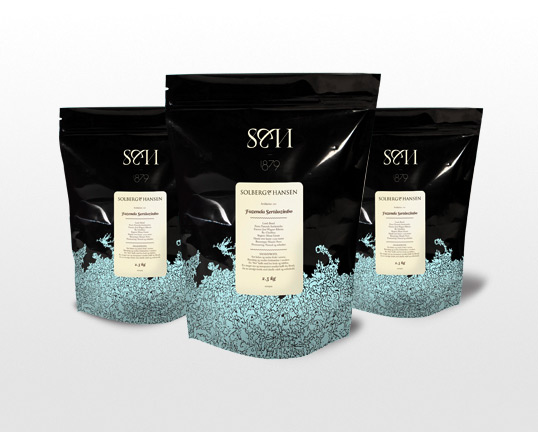
“Have you seen the future of coffee? Which coffee beans will be the most popular next year, who shall deliver the best coffee? Solberg & Hansen, one of the best and oldest coffee houses in Norway, established in 1879, has always strived to accomplish to be the best in the market and bring you the finest coffee available. Seeking predictions from reading coffee grounds, is a well known method in order to search for the answers we have about the future.The brand, logo and the signature symbol along with typography and the precise information about coffee helps the brand step up its position in the market and stand out. By adding the fresh blue color together with the ability tell a story through careful and well thought-out design, this new image shows that this brand is urgently trying to differentiate and stand out from the traditional competitors that exist in this market.”

Solberg & Hansen

Solberg & Hansen

Solberg & Hansen

Solberg & Hansen

Solberg & Hansen

Solberg & Hansen

Get the latest packaging design inspiration in your inbox:

Popular designs

Burma Love Rebrand

Love at First BiteAs an extension of the Burma Superstar restaurant in San Francisco, Burma Love Foods gives diners an opportunity to

The Port Vodka Lemon Water

Overview: In response to my client’s vision for a Cape Cod themed beverage brand, I embarked on the journey to create The Port

Over the wave

This Kombucha originates in Lombok, Indonesia, where its paradise beaches attract hundreds of surfers eager to ride the waves. When you surf,

Designed by: PepsiCo Design & Innovation
Country: United States

Solberg & Hansen

s&h1

Solberg & Hansen

Designed by Anti Design | Country: Norway

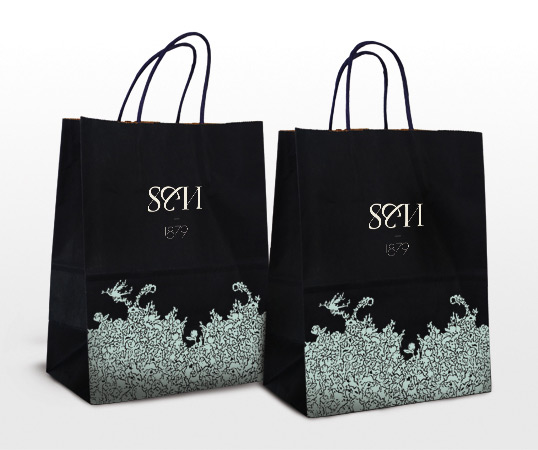
“Have you seen the future of coffee? Which coffee beans will be the most popular next year, who shall deliver the best coffee? Solberg & Hansen, one of the best and oldest coffee houses in Norway, established in 1879, has always strived to accomplish to be the best in the market and bring you the finest coffee available. Seeking predictions from reading coffee grounds, is a well known method in order to search for the answers we have about the future.The brand, logo and the signature symbol along with typography and the precise information about coffee helps the brand step up its position in the market and stand out. By adding the fresh blue color together with the ability tell a story through careful and well thought-out design, this new image shows that this brand is urgently trying to differentiate and stand out from the traditional competitors that exist in this market.”
Solberg & Hansen

Solberg & Hansen

Solberg & Hansen

Solberg & Hansen

Solberg & Hansen

Solberg & Hansen

Previous slide
Next slide

Explore more great package design

Get the latest on packaging design in your inbox: