Designed by: PepsiCo Design & Innovation
Country: United States

Student Work – Katie Riffle

Student Work - Katie Riffle

Designed by Katie Riffle | Country: United States

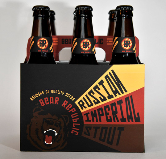
“Bear Republic has developed award winning, hand-crafted lagers and ales. Located in historic Healdsburg, California, where hop kilns from another era are still visible, their products are brewed and aged using the traditional “art” of the masters. Bear Republic’s family business is unique, from the mother who greets you at the door, to the son who brews the ales, the father who pulls tap and the daughter-in-law who keeps the books.

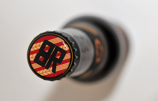
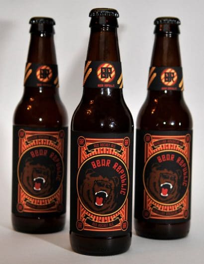
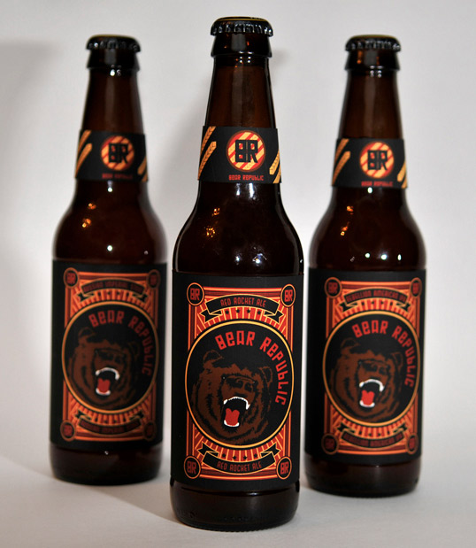
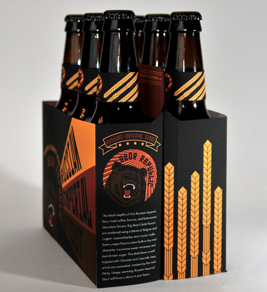
The solution was to use the name as inspiration to create a Constructivist styled logo and packaging. The beer carton is modeled after Rodchenko’s famous soviet poster. The label and carton inform each other and easily pop in a sea of tame labels: the bear, dictating you to drink and enjoy!”

Student Work - Katie Riffle

Student Work - Katie Riffle

Student Work - Katie Riffle

Get the latest packaging design inspiration in your inbox:

Popular designs

The Port Vodka Lemon Water

Overview: In response to my client’s vision for a Cape Cod themed beverage brand, I embarked on the journey to create The Port

The Bra Guru

Most women are wearing the wrong size bra and that is a fact. The Bra Guru® is the first and only professional

Over the wave

This Kombucha originates in Lombok, Indonesia, where its paradise beaches attract hundreds of surfers eager to ride the waves. When you surf,

Designed by: PepsiCo Design & Innovation
Country: United States

Student Work – Katie Riffle

br

Student Work - Katie Riffle

Designed by Katie Riffle | Country: United States

“Bear Republic has developed award winning, hand-crafted lagers and ales. Located in historic Healdsburg, California, where hop kilns from another era are still visible, their products are brewed and aged using the traditional “art” of the masters. Bear Republic’s family business is unique, from the mother who greets you at the door, to the son who brews the ales, the father who pulls tap and the daughter-in-law who keeps the books.

The solution was to use the name as inspiration to create a Constructivist styled logo and packaging. The beer carton is modeled after Rodchenko’s famous soviet poster. The label and carton inform each other and easily pop in a sea of tame labels: the bear, dictating you to drink and enjoy!”
Student Work - Katie Riffle

Student Work - Katie Riffle

Student Work - Katie Riffle

Explore more great package design

Get the latest on packaging design in your inbox: