Designed by Base | Country: Belgium
“You might not know if from the outside, but inside the doors of the stately residence at Graanmarkt 13 in Antwerp is a home where everything is for sale. Spread across three floors, the homey boutique brings together a curated world of fashion, furniture, jewelry, and design objects, from producers ranging from established houses to cutting-edge designers. On the first floor there’s a flexible space for exhibitions and presentations. A restaurant serves up the culinary creations of renowned chef Seppe Nobels, while an outdoor terrace cafe gives visitors a place to relax with a glass of Champagne. Co-founders Ilse Cornelissens and Tim Van Geloven live on the top floor with their son and their dog George. Says Ilse, “Our home, in a way, is open to everyone.”
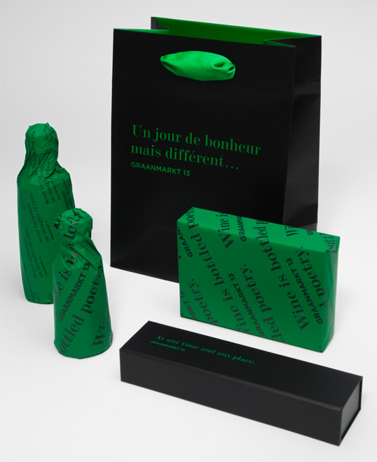
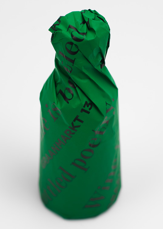
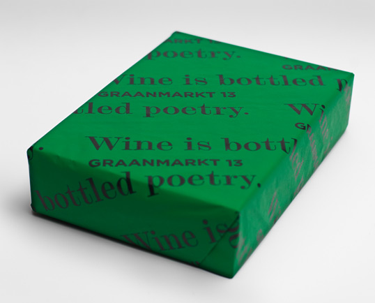
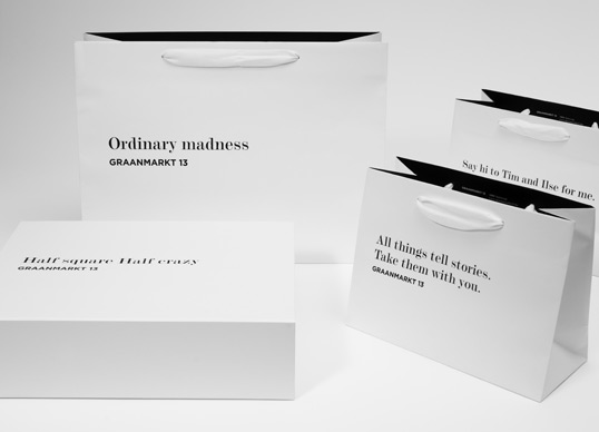
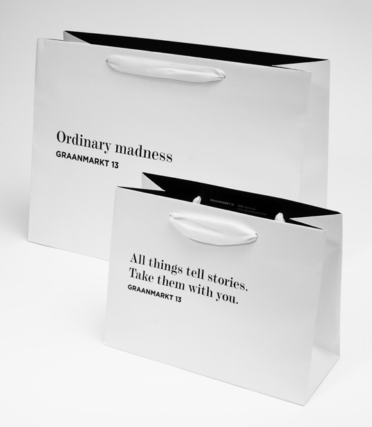
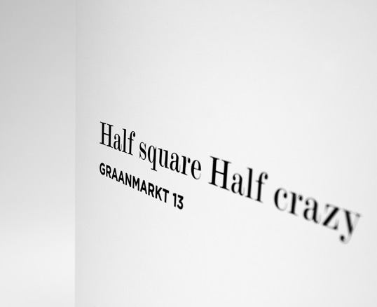
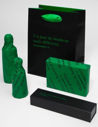
We designed the identity for Graanmarkt 13 from the ground up. Because Ilse and Tim didn’t want the store to be defined by a name, we decided with them to use the street address. But more than the way a name typically functions, Graanmarkt 13 is used as a signature, beneath an ever-changing series of evocative, unrestricted phrases. In this way, what is said can change freely with the seasons and with the context of the printed piece. But Graanmarkt 13 is always who is saying it and where it’s being said.
We started by researching quotations from novels, poems, flims, based on the ideas of the store: home, the story of Tim and Ilse, the house itself. To bring out the feeling of a story, we knew we wanted to use a serif typeface for these phrases. We started with Baskerville, but then opted for the more distinctive Modern n° 20. For the store signature, we use sans serif typeface Gotham Bold, a choice inspired by the typeface used in Antwerp’s street signs. For visibility, the signature—always positioned under the quote, and in smaller size—is set in bold capitals. With the exception of the façade of the house, the logo is never used without a phrase.”

