Designed by: PepsiCo Design & Innovation
Country: United States

64 by Rio Coffee

64 by Rio Coffee

Designed by Voice | Country: Australia

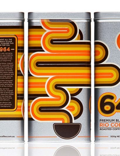
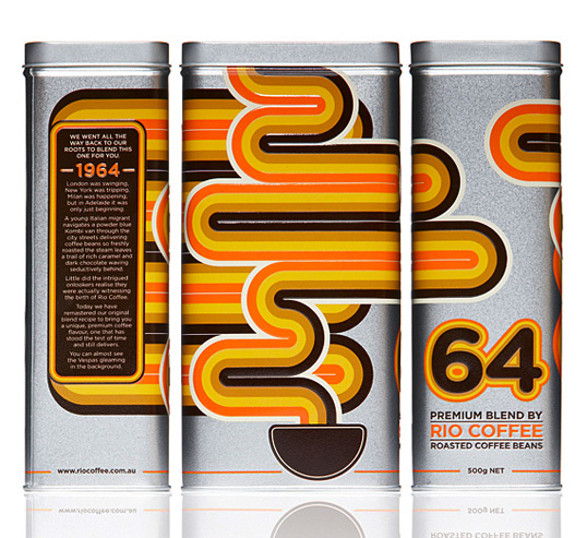
“Rio Coffee has been hand roasting Australia’s favourite Coffees since 1964, with 14 varieties already in their portfolio. The aim was to create a premium coffee product that reinforced Rio Coffee’s longevity in the coffee industry and evoking a sense of nostalgia by looking back at the birth of the brand.

The aim was to create a premium, contemporary solution whilst maintaining a style reminiscent of the 60s. The design is influenced the by colours and patterns of the 60s. It uses simple geometric shapes and colours to represent the rising aroma and steam from a cup of coffee. Tin was chosen to package the coffee as to reinforce its connection to the past as well as underpin its premium status.”

Get the latest packaging design inspiration in your inbox:

Popular designs

Burma Love Rebrand

Love at First BiteAs an extension of the Burma Superstar restaurant in San Francisco, Burma Love Foods gives diners an opportunity to

Over the wave

This Kombucha originates in Lombok, Indonesia, where its paradise beaches attract hundreds of surfers eager to ride the waves. When you surf,

The Bra Guru

Most women are wearing the wrong size bra and that is a fact. The Bra Guru® is the first and only professional

The Port Vodka Lemon Water

Overview: In response to my client’s vision for a Cape Cod themed beverage brand, I embarked on the journey to create The Port

Designed by: PepsiCo Design & Innovation
Country: United States

64 by Rio Coffee

64

64 by Rio Coffee

Designed by Voice | Country: Australia

“Rio Coffee has been hand roasting Australia’s favourite Coffees since 1964, with 14 varieties already in their portfolio. The aim was to create a premium coffee product that reinforced Rio Coffee’s longevity in the coffee industry and evoking a sense of nostalgia by looking back at the birth of the brand.

The aim was to create a premium, contemporary solution whilst maintaining a style reminiscent of the 60s. The design is influenced the by colours and patterns of the 60s. It uses simple geometric shapes and colours to represent the rising aroma and steam from a cup of coffee. Tin was chosen to package the coffee as to reinforce its connection to the past as well as underpin its premium status.”

Previous slide
Next slide

Explore more great package design

Get the latest on packaging design in your inbox: