Designed by: PepsiCo Design & Innovation
Country: United States

Queen Mary Tea

Queen Mary Tea

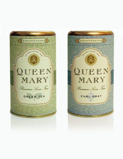
Designed by Niedermeier Design | Country: United States “Queen Mary Tea began as an upscale boutique cafe where patrons could enjoy full leaf teas from around the world while being immersed in a Victorian-style ambiance. Now they were looking to expand their customer base by selling premium tea products in high-end spas, hotels, and restaurants. As the name suggests, celebrating England’s rich tradition of midday tea is what first inspired the creation of this gourmet brand.

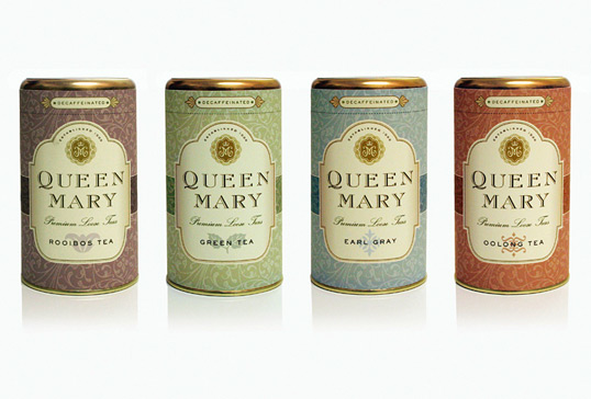
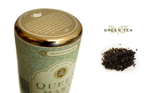
Carrying this original vision through to their packaging would be essential to achieving consistent brand representation. New flavor-based iconography and a distinct color palette were used to distinguish the various tea groups and helped clarify customer choice. A revised logo designed specifically for use with embossing and foil-stamping would allow for that extra special touch on thank you cards, invitations and other brand correspondence.”

Queen Mary Tea

Get the latest packaging design inspiration in your inbox:

Popular designs

The Bra Guru

Most women are wearing the wrong size bra and that is a fact. The Bra Guru® is the first and only professional

Over the wave

This Kombucha originates in Lombok, Indonesia, where its paradise beaches attract hundreds of surfers eager to ride the waves. When you surf,

Designed by: PepsiCo Design & Innovation
Country: United States

Queen Mary Tea

queen1

Queen Mary Tea

Designed by Niedermeier Design | Country: United States “Queen Mary Tea began as an upscale boutique cafe where patrons could enjoy full leaf teas from around the world while being immersed in a Victorian-style ambiance. Now they were looking to expand their customer base by selling premium tea products in high-end spas, hotels, and restaurants. As the name suggests, celebrating England’s rich tradition of midday tea is what first inspired the creation of this gourmet brand.

Carrying this original vision through to their packaging would be essential to achieving consistent brand representation. New flavor-based iconography and a distinct color palette were used to distinguish the various tea groups and helped clarify customer choice. A revised logo designed specifically for use with embossing and foil-stamping would allow for that extra special touch on thank you cards, invitations and other brand correspondence.”
Queen Mary Tea

Previous slide
Next slide

Explore more great package design

Get the latest on packaging design in your inbox: