Designed by: PepsiCo Design & Innovation
Country: United States

Theurel & Thomas

Theurel & Thomas

Designed by Anagram | Country: Mexico

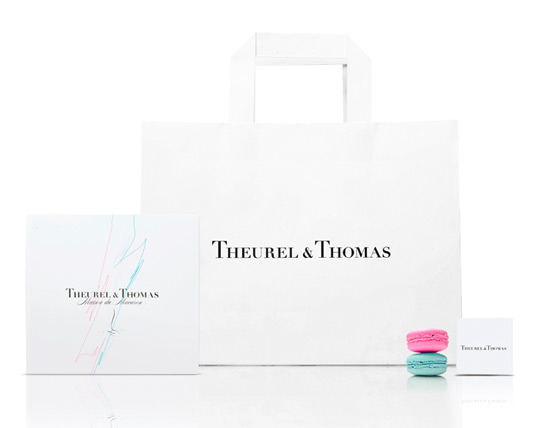
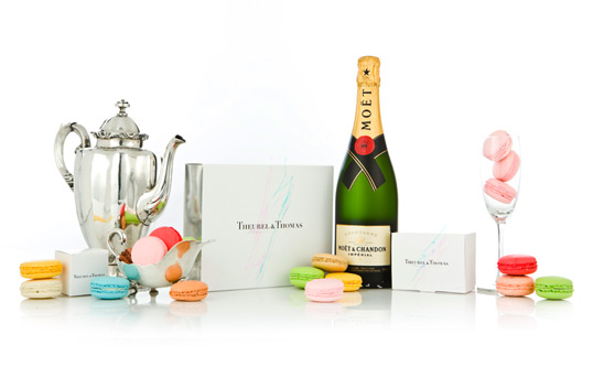
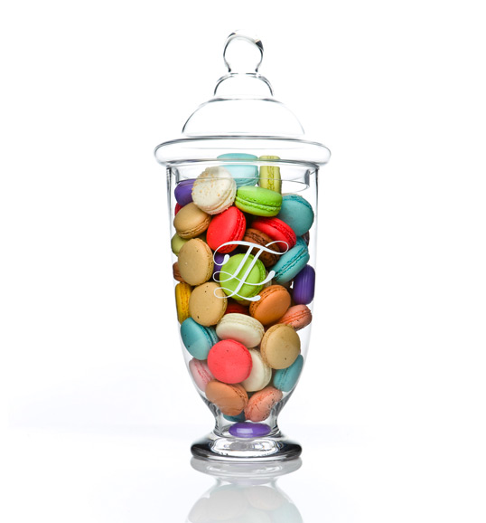
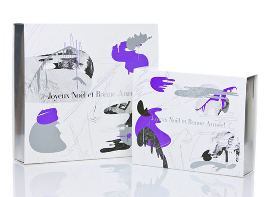
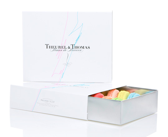
“Theurel & Thomas is the first pâtisserie in Mexico specialized in French macarons, the most popular dessert of the French pastries.

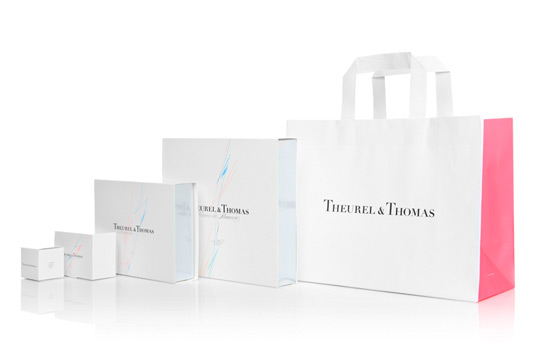
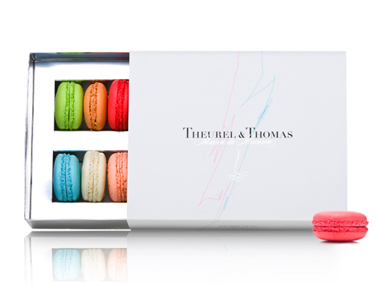
For this project it was very important to create an imposing brand that would emphasize the unique value, elegance and detail of this delicate dessert.

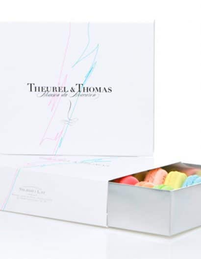
White was our primary tool for design. As a result of this the attention was fully oriented to the colorful macarons. We placed two lines in our design in cyan and magenta, as a relation with a modern French flag to inject a vanguard vision to the identity. We selected Didot (created by Firmin and Pierre Didot), a French typography that would present the brand with sophistication.”

Theurel & Thomas

Theurel & Thomas

Theurel & Thomas

Theurel & Thomas

Theurel & Thomas

Theurel & Thomas

Theurel & Thomas

Get the latest packaging design inspiration in your inbox:

Popular designs

Burma Love Rebrand

Love at First BiteAs an extension of the Burma Superstar restaurant in San Francisco, Burma Love Foods gives diners an opportunity to

Over the wave

This Kombucha originates in Lombok, Indonesia, where its paradise beaches attract hundreds of surfers eager to ride the waves. When you surf,

The Port Vodka Lemon Water

Overview: In response to my client’s vision for a Cape Cod themed beverage brand, I embarked on the journey to create The Port

Designed by: PepsiCo Design & Innovation
Country: United States

Theurel & Thomas

theurel1

Theurel & Thomas

Designed by Anagram | Country: Mexico

“Theurel & Thomas is the first pâtisserie in Mexico specialized in French macarons, the most popular dessert of the French pastries.

For this project it was very important to create an imposing brand that would emphasize the unique value, elegance and detail of this delicate dessert.

White was our primary tool for design. As a result of this the attention was fully oriented to the colorful macarons. We placed two lines in our design in cyan and magenta, as a relation with a modern French flag to inject a vanguard vision to the identity. We selected Didot (created by Firmin and Pierre Didot), a French typography that would present the brand with sophistication.”
Theurel & Thomas

Theurel & Thomas

Theurel & Thomas

Theurel & Thomas

Theurel & Thomas

Theurel & Thomas

Theurel & Thomas

Previous slide
Next slide

Explore more great package design

Get the latest on packaging design in your inbox: