Designed by: PepsiCo Design & Innovation
Country: United States

Clive’s Pot of

Clive's Pot of

Designed by biz-R | Country: United Kingdom | Fonts used: V.A.G. Rounded

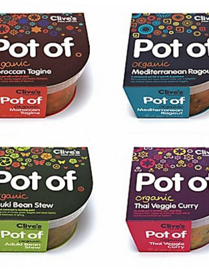
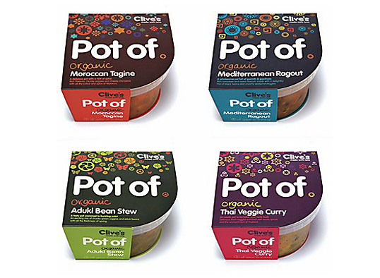
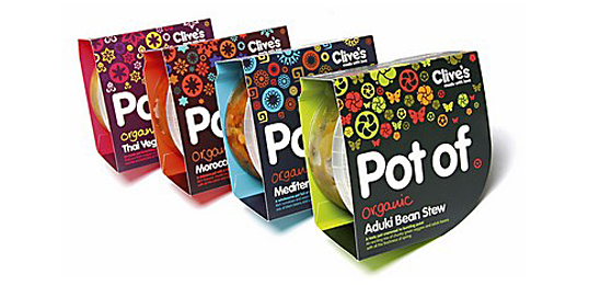
“Devon, England-based biz-R recently completed this project for Clive’s new range of fresh organic meals available from independent food stores, farm shops and other organic food retailers. The approach challenges packaging design in a market currently saturated with uninspiring international brands and bland own label products; through distinct differentiation it assists Clive’s as they expand and diversify their product range. What sets them apart from everything else in this market is a bold, graphic, identity based on symbology, pattern and color associated with each recipe’s origin. The eye-catching result communicates beautifully, on and off the shelf. The cardboard sleeve was adapted to accommodate the clear plastic pot and reveal as much of the content as possible.”
Clive's Pot of

Get the latest packaging design inspiration in your inbox:

Popular designs

The Bra Guru

Most women are wearing the wrong size bra and that is a fact. The Bra Guru® is the first and only professional

Burma Love Rebrand

Love at First BiteAs an extension of the Burma Superstar restaurant in San Francisco, Burma Love Foods gives diners an opportunity to

The Port Vodka Lemon Water

Overview: In response to my client’s vision for a Cape Cod themed beverage brand, I embarked on the journey to create The Port

Designed by: PepsiCo Design & Innovation
Country: United States

Clive’s Pot of

potof1

Clive's Pot of

Designed by biz-R | Country: United Kingdom | Fonts used: V.A.G. Rounded

“Devon, England-based biz-R recently completed this project for Clive’s new range of fresh organic meals available from independent food stores, farm shops and other organic food retailers. The approach challenges packaging design in a market currently saturated with uninspiring international brands and bland own label products; through distinct differentiation it assists Clive’s as they expand and diversify their product range. What sets them apart from everything else in this market is a bold, graphic, identity based on symbology, pattern and color associated with each recipe’s origin. The eye-catching result communicates beautifully, on and off the shelf. The cardboard sleeve was adapted to accommodate the clear plastic pot and reveal as much of the content as possible.”

Clive's Pot of

Previous slide
Next slide

Explore more great package design

Get the latest on packaging design in your inbox: