Designed by: PepsiCo Design & Innovation
Country: United States

Sir Kensington’s Gourmet Scooping Ketchup

Sir Kensington's Gourmet Scooping Ketchup

Designed by Alvin Diec | Country: United States | Buy it

Sir Kensington’s Gourmet Scooping Ketchup: an all-natural ketchup that is too exquisite to be squeezed from a plastic bottle.

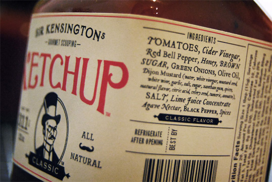
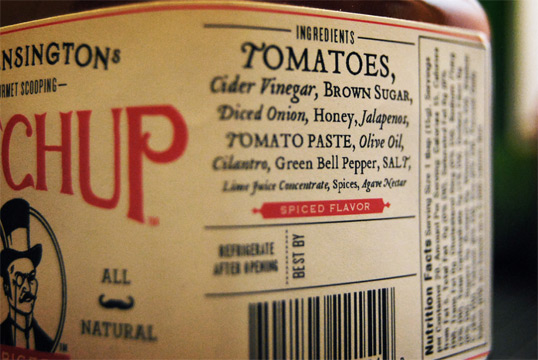
The company was born out of an attempt to fill the dire market need for a gourmet ketchup – one that is healthier, tastier, and higher-end. The result was two flavors of ketchup, Classic and Spiced (chipotle-infused), both of which are sweetened only with honey, agave nectar, and raw brown sugar, with a base of whole pear tomatoes and apple cider vinegar.

Sir Kensington's Gourmet Scooping Ketchup

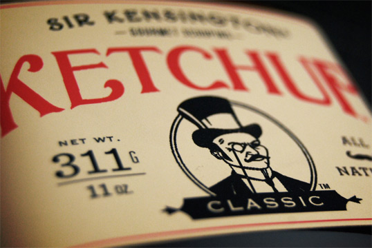
Sir Kensington’s Gourmet Scooping Ketchup recently premiered at the Summer Fancy Food Show in New York, where we received significant praise for and attention to packaging design and brand aesthetic. It wasn’t uncommon for passersby to not want to try our actual product, but almost everyone wanted to pick up our jars, read the labels, stick our Sir Kensington mustache stickers on their upper lip, take a business card, and compliment us on our choice of such a distinctly anachronistic, yet aristocratic British cartoon gentlemen as our company’s figurehead.

Sir Kensington's Gourmet Scooping Ketchup

Sir Kensington's Gourmet Scooping Ketchup

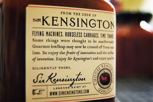
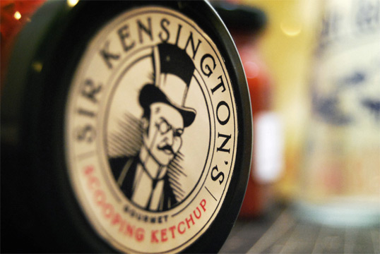
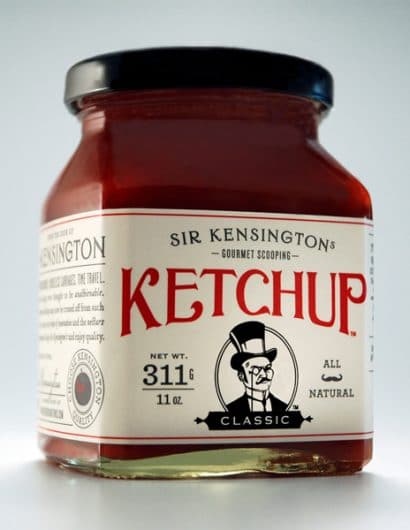
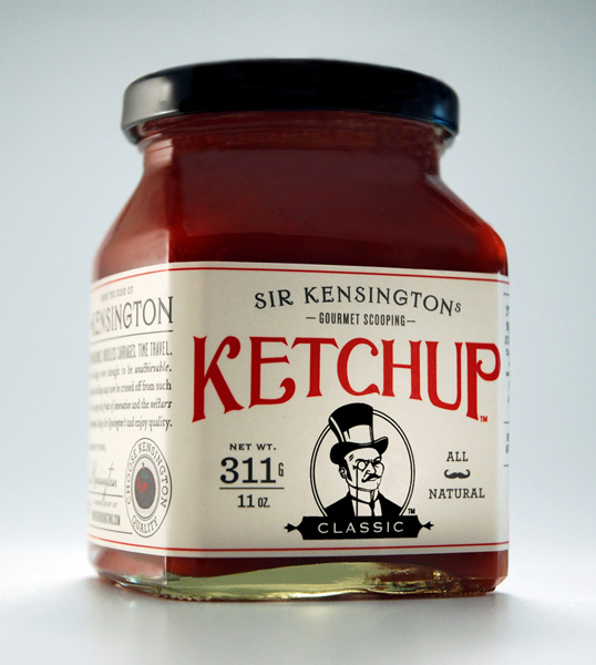
Our goal in creating the Sir Kensington’s brand was to create a holistically gourmet experience. Everything from the labels, to the business cards, to the jar size to the choice of fonts and the choice of colors contributes to a unique and memorable brand identity that stays with consumers beyond the point-of-purchase. The varied font sizes, deliberately 19th-century fonts, and heavy use of Bodoni-style bullets and ornaments result in a consistently vintage appearance. To us, it’s not just a good-looking and amusing label; Sir Kensington the character, the image of his mustache, and the anachronistic typography and styling of documents such as our Media Kit all serve to create a distinct and fun brand identity that we hope will steer people away from other ketchups and create a compelling reason to enjoy a healthier, gourmet option.

Sir Kensington's Gourmet Scooping Ketchup

Sir Kensington's Gourmet Scooping Ketchup

Our packaging and brand identity design was led by Alvin Diec, whom we actually found through Lovely Package.

Sir Kensington's Gourmet Scooping Ketchup

Get the latest packaging design inspiration in your inbox:

Popular designs

The Bra Guru

Most women are wearing the wrong size bra and that is a fact. The Bra Guru® is the first and only professional

Pure Persian Honey

When we look closely at honey packaging, they are almost all in the usual format, and the ultimate in creativity is that

Burma Love Rebrand

Love at First BiteAs an extension of the Burma Superstar restaurant in San Francisco, Burma Love Foods gives diners an opportunity to

Designed by: PepsiCo Design & Innovation
Country: United States

Sir Kensington’s Gourmet Scooping Ketchup

kensignton1

Sir Kensington's Gourmet Scooping Ketchup

Designed by Alvin Diec | Country: United States | Buy it

Sir Kensington’s Gourmet Scooping Ketchup: an all-natural ketchup that is too exquisite to be squeezed from a plastic bottle.

The company was born out of an attempt to fill the dire market need for a gourmet ketchup – one that is healthier, tastier, and higher-end. The result was two flavors of ketchup, Classic and Spiced (chipotle-infused), both of which are sweetened only with honey, agave nectar, and raw brown sugar, with a base of whole pear tomatoes and apple cider vinegar.

Sir Kensington's Gourmet Scooping Ketchup

Sir Kensington’s Gourmet Scooping Ketchup recently premiered at the Summer Fancy Food Show in New York, where we received significant praise for and attention to packaging design and brand aesthetic. It wasn’t uncommon for passersby to not want to try our actual product, but almost everyone wanted to pick up our jars, read the labels, stick our Sir Kensington mustache stickers on their upper lip, take a business card, and compliment us on our choice of such a distinctly anachronistic, yet aristocratic British cartoon gentlemen as our company’s figurehead.

Sir Kensington's Gourmet Scooping Ketchup

Sir Kensington's Gourmet Scooping Ketchup

Our goal in creating the Sir Kensington’s brand was to create a holistically gourmet experience. Everything from the labels, to the business cards, to the jar size to the choice of fonts and the choice of colors contributes to a unique and memorable brand identity that stays with consumers beyond the point-of-purchase. The varied font sizes, deliberately 19th-century fonts, and heavy use of Bodoni-style bullets and ornaments result in a consistently vintage appearance. To us, it’s not just a good-looking and amusing label; Sir Kensington the character, the image of his mustache, and the anachronistic typography and styling of documents such as our Media Kit all serve to create a distinct and fun brand identity that we hope will steer people away from other ketchups and create a compelling reason to enjoy a healthier, gourmet option.

Sir Kensington's Gourmet Scooping Ketchup

Sir Kensington's Gourmet Scooping Ketchup

Our packaging and brand identity design was led by Alvin Diec, whom we actually found through Lovely Package.

Sir Kensington's Gourmet Scooping Ketchup

Previous slide
Next slide

Explore more great package design

Get the latest on packaging design in your inbox: