Designed by: PepsiCo Design & Innovation
Country: United States

Student Work – Hamish Smyth

Student Work - Hamish Smyth

Designed by Hamish Smyth | Country: Australia

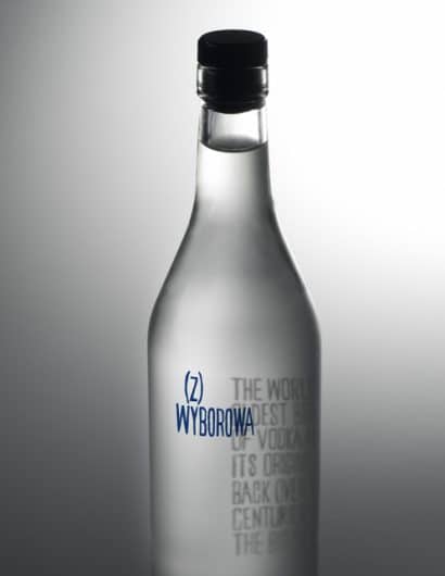
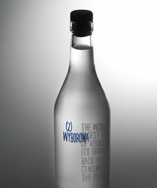
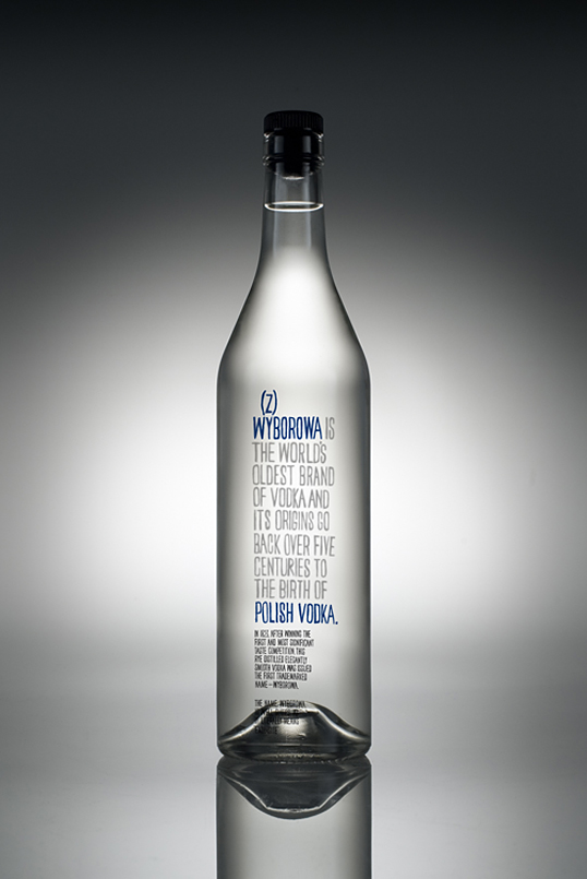
“I re-branded the Polish Vodka brand Wyborowa. My concept uses hand drawn typography – arching back traditional Polish graphic design which featured a lot of handmade type. The clarity of the vodka is its main feature, which is emphasised by having the story of the Vodka’s origin on the back of the bottle. The viewer peers through the product to read the story. When viewed on an angle the viewer gets an interesting warped optical effect whilst isolating the products name on the front of the bottle.”
Student Work - Hamish Smyth

Get the latest packaging design inspiration in your inbox:

Popular designs

The Bra Guru

Most women are wearing the wrong size bra and that is a fact. The Bra Guru® is the first and only professional

Pure Persian Honey

When we look closely at honey packaging, they are almost all in the usual format, and the ultimate in creativity is that

The Port Vodka Lemon Water

Overview: In response to my client’s vision for a Cape Cod themed beverage brand, I embarked on the journey to create The Port

Designed by: PepsiCo Design & Innovation
Country: United States

Student Work – Hamish Smyth

wyborowa1

Student Work - Hamish Smyth

Designed by Hamish Smyth | Country: Australia

“I re-branded the Polish Vodka brand Wyborowa. My concept uses hand drawn typography – arching back traditional Polish graphic design which featured a lot of handmade type. The clarity of the vodka is its main feature, which is emphasised by having the story of the Vodka’s origin on the back of the bottle. The viewer peers through the product to read the story. When viewed on an angle the viewer gets an interesting warped optical effect whilst isolating the products name on the front of the bottle.”

Student Work - Hamish Smyth

Previous slide
Next slide

Explore more great package design

Get the latest on packaging design in your inbox: